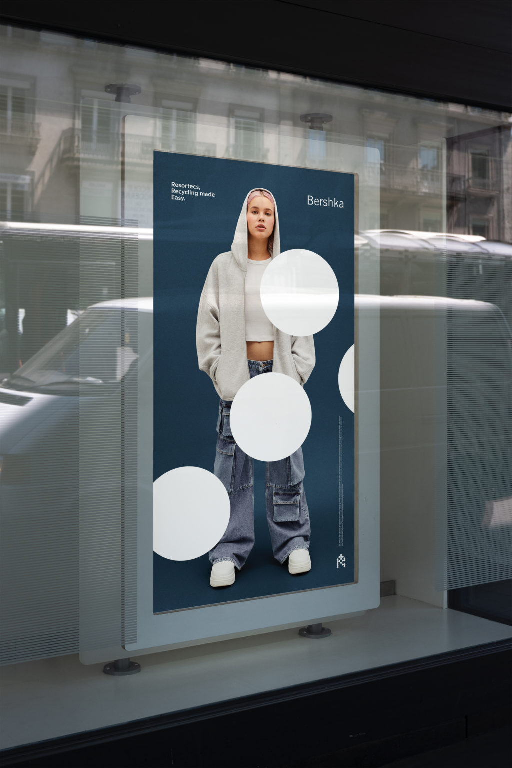
Resortecs is a trendsetter in tackling fashion’s environmental impact. They’ve cracked the code with their out-of-the-box design strategy that’s all about going full circle and kicking textile waste to the curb. These fashion protagonists weave smart and sustainable solutions right into their garment designs.
At the core of Resortecs’ design strategy is the use of dissolvable stitching and heat-sensitive thread. Traditional stitching and thread used in garments make them difficult to recycle, as they need to be removed manually before the fabric can be processed. Resortecs, however, has introduced dissolvable stitching that can be easily dissolved in water or heat-sensitive thread that can be melted away, enabling the disassembly of garments at the end of their life cycle. Resortecs is flipping the script on traditional garment construction, lighting the way to a fashion future where disassembling, recycling, and breathing new life into clothes becomes possible. By reimagining the traditional approach to garment construction, they are paving the way for a more sustainable future in the fashion industry, where garments can be easily disassembled, recycled, and given new life, ultimately reducing the industry’s environmental footprint. They now work with fashion leaders such as Bershka, Lacoste and H&M.
Unlocking the big picture
During its development, Resortecs’ team worked on the optimization of their product and had set aside their visual identity. They were somehow too caught up in the details and lacked perspective. They requested us to build an innovative and unique identity that still adhered to corporate standards.
At Stoëmp, we emphasize the importance of human connections and meaningful exchanges as part of the branding journey. That’s why we take time to discuss, evaluate and rethink the strategy, like real partners.
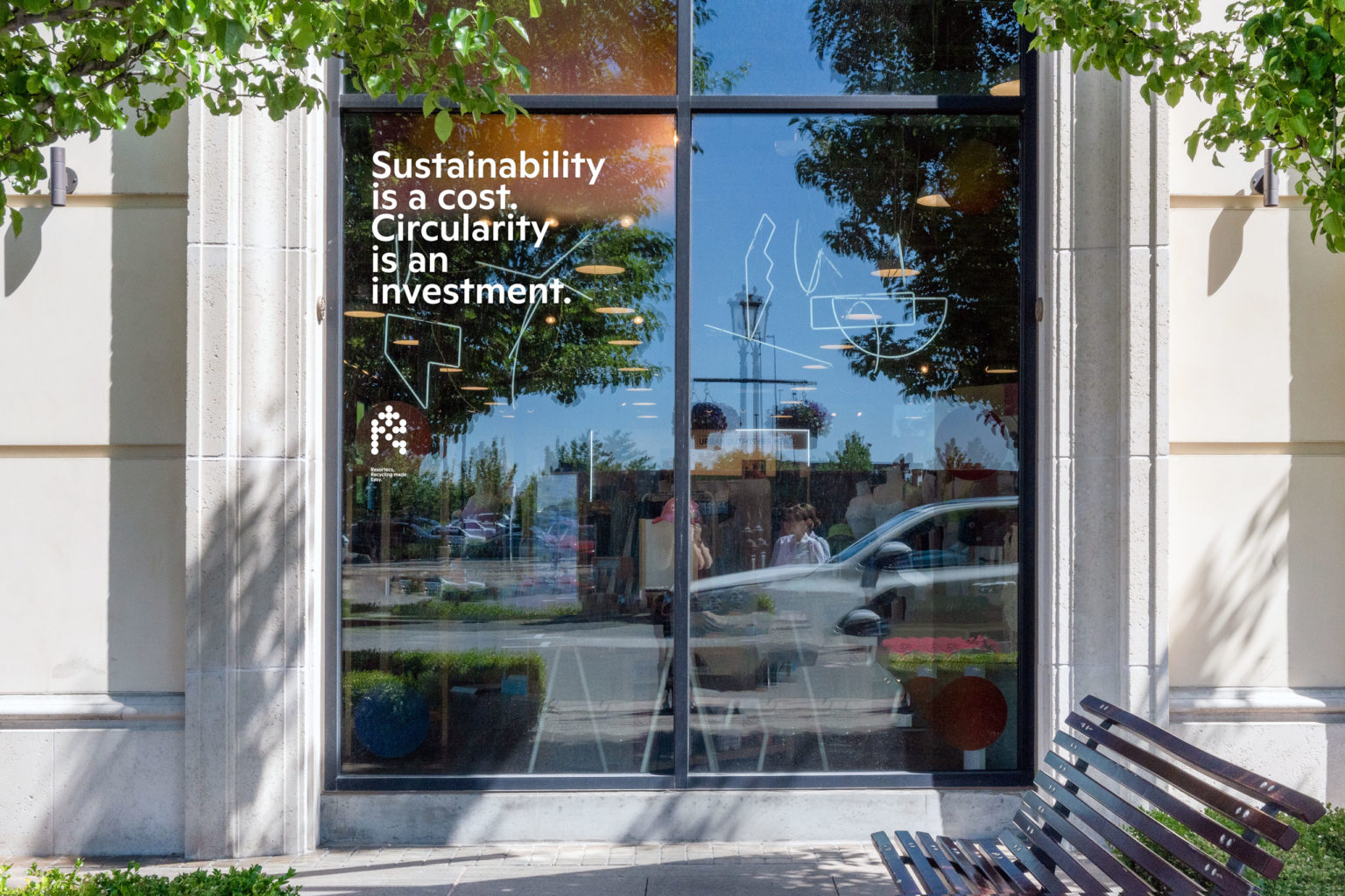
The foundation of this project was the concept of positioning Resortecs on par with Goretex and showcasing their collaborations with renowned brands. We refined their positioning, pumped up their value proposition, and crafted an inspiring verbal identity and eye-popping visual presence. It’s all about striking the perfect balance between inspiring language and graphics that pack a punch.
Designing for disassembly
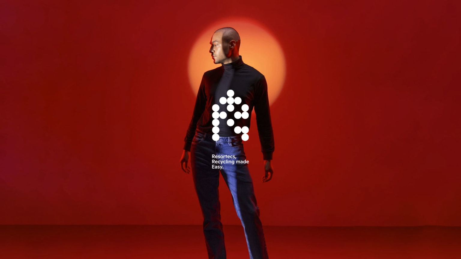
Based on this moto, we developed a logotype made of dots. Those “stepping stones” underline the idea of connection and assembly. One step at a time, Resortecs aims to become a key element in the garment’s life cycle and to close the loop of sustainability with a simple a scalable solution. A vision we aimed to embody in their visual identity.
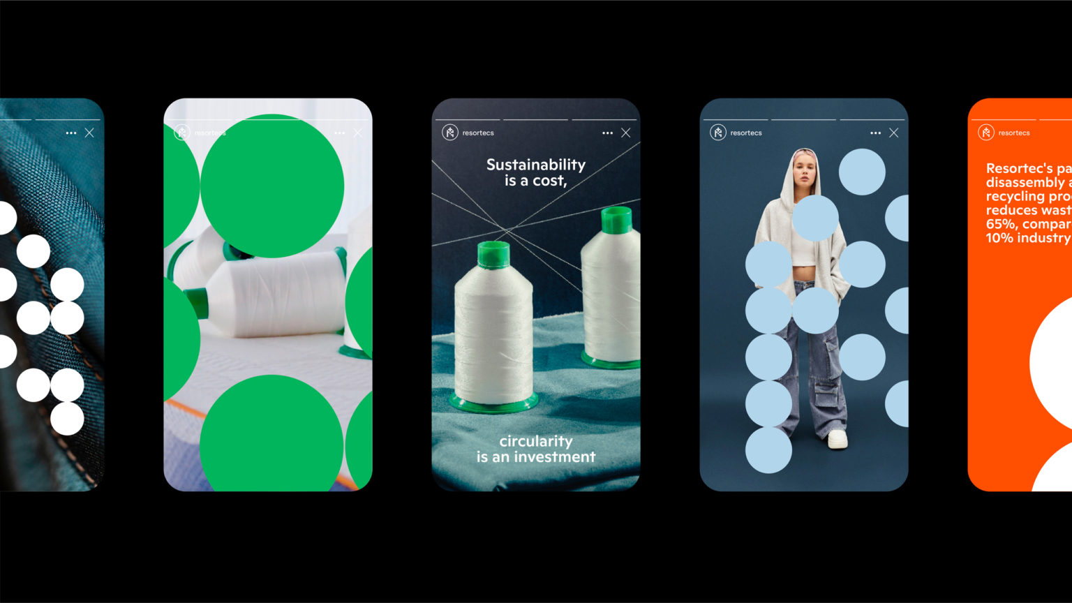
The concept of “appearance, disappearance” inspired us to whip up a script that creates random shapes, which we transformed into letters. It adds a dynamic and unforgettable touch to their visual identity. We found inspiration in Damien Hirst’s mind-blowing artwork, like ‘The Currency’ and ‘The Spot Painting.’ Imagine a typography that combines the spontaneity of Hirst’s creations with some structured elements. Voila!
Their logo and brand elements feature eco-friendly colors like green and blue, symbolizing nature and water. The use of clean and contemporary design elements further communicates their innovative and forward-thinking image.
Words with a Promise
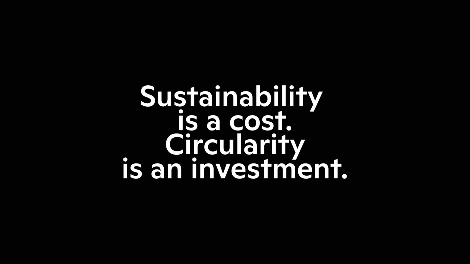
When it comes to the verbal strategy, we aimed to blend corporate vibes with a sprinkle of artistic flair. We wanted to transform Resortecs’ corporate and impersonal verbal identity into something dynamic, harmonious and trendy. It’s not just about the product; it’s about showcasing the team, the awesome community, and the solid partners they’ve got in their corner. We made sure that the words they use evoke a sense of purpose that supports their promise: “Sustainability doesn’t have to break the bank”. Resortecs brings the magic with their simple, scalable (almost magical) solutions that shake up brands and empower them to embrace impactful, cost-effective innovation.
Early on in our collaboration, we identified three key characteristics to define the verbal identity: SIMPLE, CUTTING EDGE, and REALISTIC.
Simple, because Resortecs wants to explain complex concepts in a way that anyone can understand. No mumbo-jumbo or technical talk here. They want their message to reach a wide audience.
Cutting-edge, because Resortecs is all about breaking the mold of traditional garment design. They’re on the cutting edge, using their unique technology and materials to blow your mind.
Realistic, because Resortecs doesn’t fluff it up, their solutions offer a tangible way to address the problem. Their tone of voice is concrete, relevant, and humble. They shine a spotlight on the potential for positive change and the endless opportunities for sustainable innovation within the fashion industry.
Taking cues from talented artists like Philipe Glass, Resortecs has carefully curated an impressive assortment of statements that can be utilized across various communication channels. The tone of voice we developed for Resortecs strikes a harmonious balance between professionalism and relatability, effectively showcasing their expertise, passion, and optimism: they inspire and motivate others to embrace sustainable fashion practices with enthusiasm and confidence.
Sailing the currents
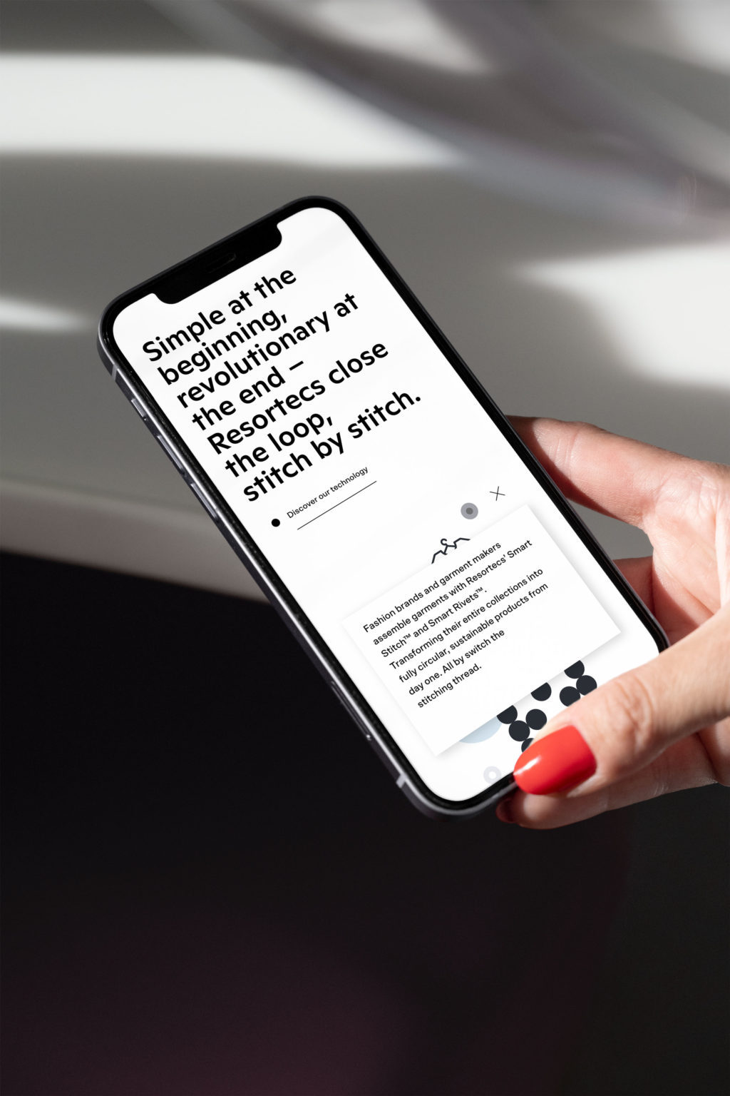
The identity has been applied across various internal and external mediums, including presentations, PowerPoint slides, websites, and more.
Regarding the environmentally friendly aspect, a key principle was to print only what is necessary. From the very beginning, the idea was to minimize printing, with all materials being digital. This approach eliminated the need for printed business cards, stationery, and other paper-based items. By embracing a digital-first approach, the project aimed to reduce waste and promote sustainability.
Resortecs’ rebranding have garnered attention and earned them a well-deserved reputation. The press has taken notice of the company’s immense potential and has highlighted their technological innovation. Journalists have also recognized Resortecs as a trailblazer in transparency, showcasing the people, teams, communities, and partners behind their products. By emphasizing the human element, we successfully differentiated Resortecs from the traditional fashion actors.
The outcome of our collaboration is definitely successful, whether we consider Resortecs’ positioning, their captivating verbal expression, or their striking design. Our mission, “Where brands find themselves,” continues to drive us to explore and maximize our clients’ potential. A great feeling of accomplishment that fuels our daily motivation.
TEAM :
THOMAS, GAETANO FOR THE STRATEGY
GAETANO & WOJTEK FOR THE DESIGN
DAVID FOR THE ANIMATION
AILSA & DANA FOR THE TONE OF VOICE
LÉO FOR THE WEB DEVELOPMENT