Searching for the sublime since 1998
-
Since the earliest ages, humans have been fascinated with the natural elements Earth offers us, developing a will to tame, sublimate, and use them to our advantage. Not only for our survival, but also for our entertainment; upholding our relationship of admiration, awe, and joy by means of spectacular fireworks, waterfalls, fountains, and more.
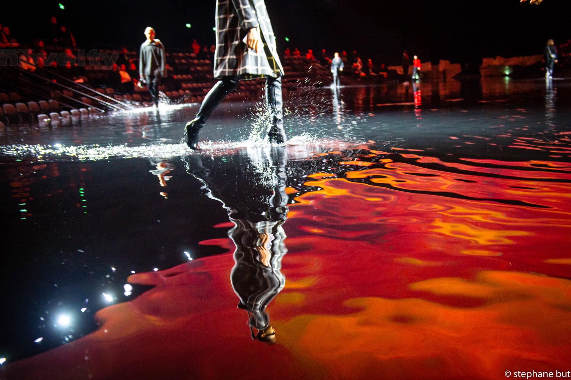
CRYSTAL is no stranger to this idea: as a world leader in special effects (SFX) created with fire, ice, and water their daily challenge is to harness the creative potential of the elements, ever surpassing spectators expectations, and perhaps at times even challenging the laws of physics themselves.
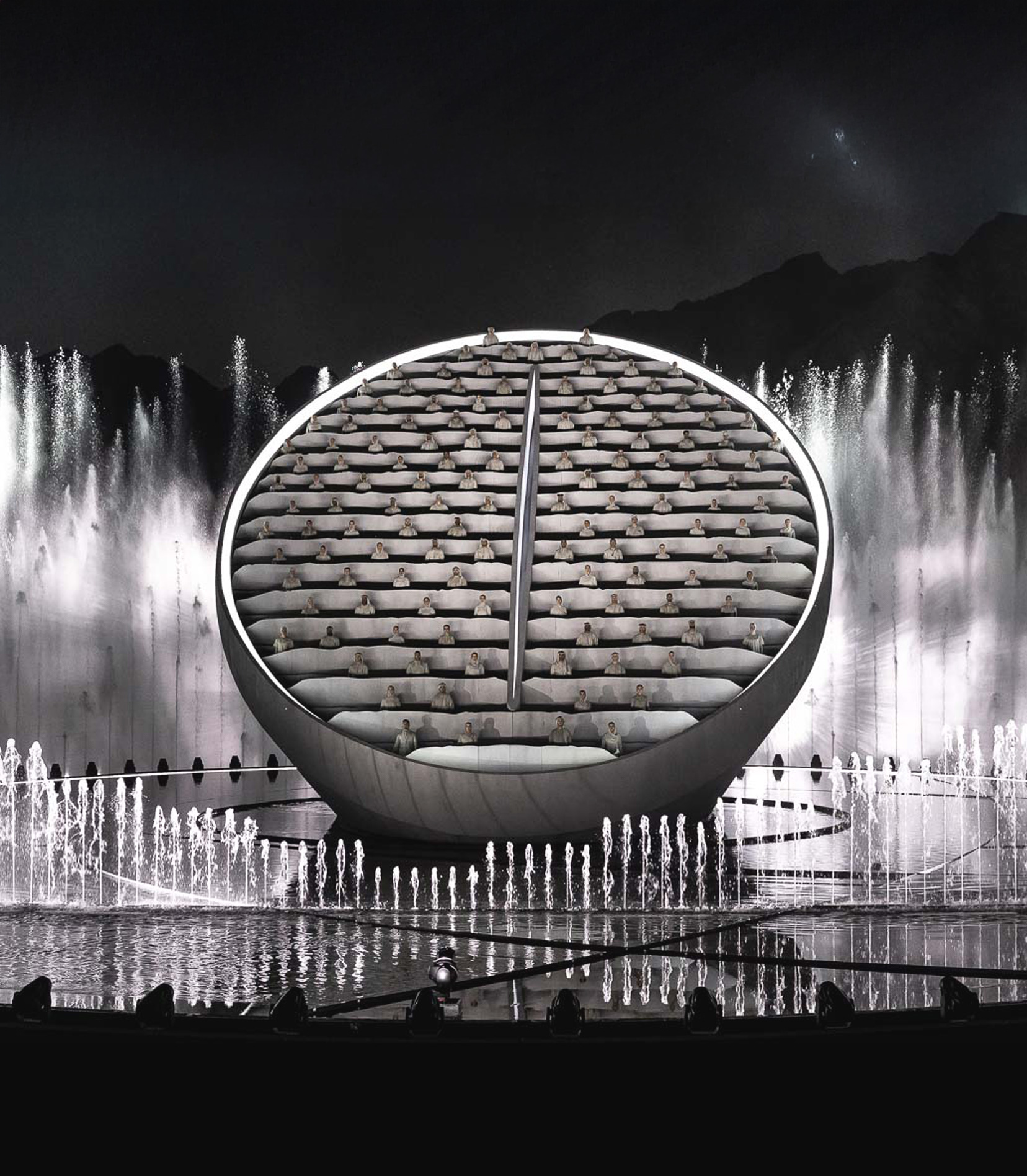
For over two decades, CRYSTAL has perfected their artistry and engineering internationally, applying it to fire, ice, and water in order to produce unforgettable moments filled with emotion. Whether setting up fountains in Versailles, creating an offshore water display in Dubai, or masterminding a pyrotechnic chef d’oeuvre in one of France’s major theme parks, CRYSTAL rises to any challenge and achieves it.
The “wow effect”: from idea to implementation
On the occasion of their twentieth anniversary CRYSTAL approached Stoëmp, looking for a brand agency to redesign their visual identity, and to reaffirm their position on the market as international experts and world leaders in their domain. Their current branding had been sidelined, as is often the case for fast-expanding companies, and they simply hadn’t had the time to review their image for several years. Therefore CRYSTAL’s brief was to communicate to future prospects and clients their true, dynamic and forward-thinking essence, characterised by what they succinctly call the “WOW EFFECT”. Indeed, each display, special effect, or scenography created by CRYSTAL leads viewers to stand back in awe. Their communication needed to be crafted in order to do just the same.We analysed the current situation of the brand, and quickly realised their positioning was putting too much simplified emphasis on the materials and elements themselves rather than their unique selling proposition: A renowned expertise and creative spirit which leads to the crystallisation of unforgettable moments, packed with emotion. Shining a light on their individuality as creators of memories, moments, and emotion was the path we took in developing a new visual and verbal brand matrix. We totally overhauled how CRYSTAL communicates, whether internally with staff and stakeholders or externally with clients and spectators. Our strategy and recommendations were based upon both an in-house analysis—which led us to meet key members of the CRYSTAL team—and feedback from clients on completed projects, as well as taking into account the CEO and partners’ wants and needs.
From the monumental to the minute
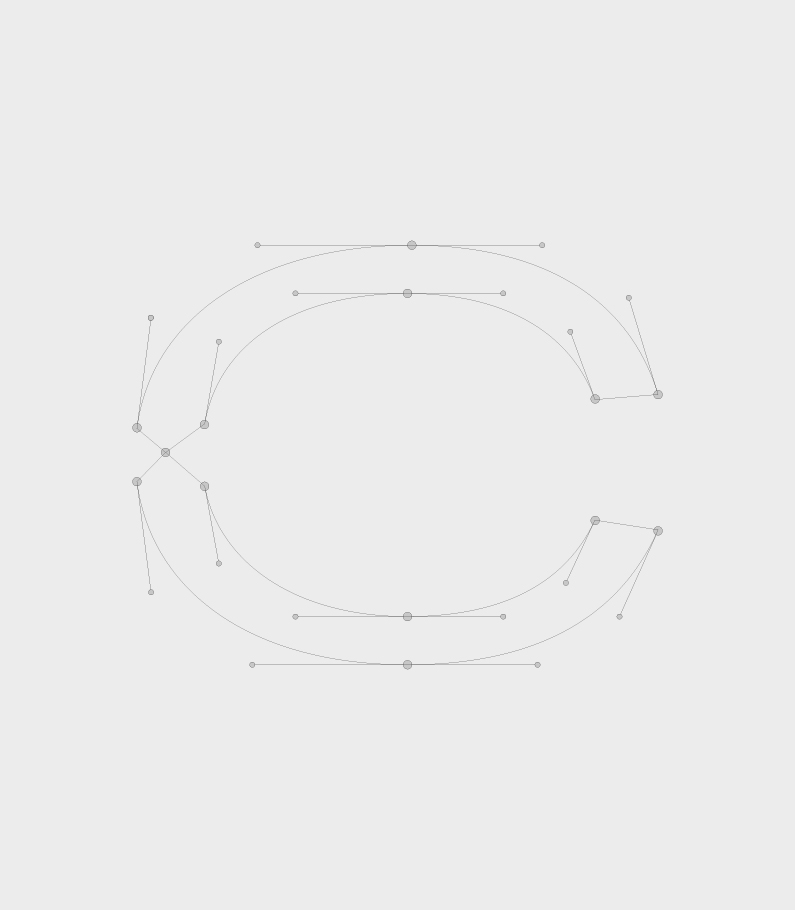
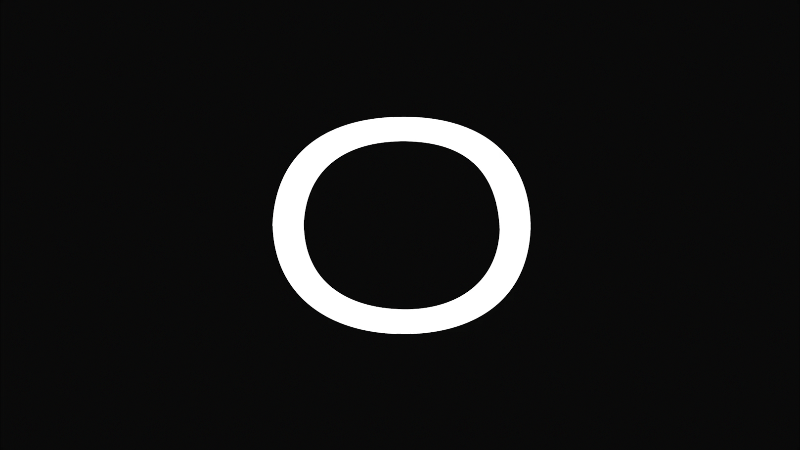
CRYSTAL’s identity had to be iconic: we knew that the creation of their new branding would be as challenging as their day-to-day exploits. With this in mind, we crafted a custom font which led to the creation of a hard-hitting logo and visual system that would be recognisable on any media, in any language, in any context. Whether applied monumentally to a shipping container in Dubai or discreetly to a t-shirt in the company’s workshop in the Paris suburbs, the CRYSTAL signature is intended to become a classic.We delved into more than twenty years of archives in order to grasp CRYSTAL’s true personality, and to convey it in the best possible way. In addition to this, we followed our in-depth methodology to produce a fitting, forward-thinking verbal identity, providing the client with a communications charter to follow, from the creation of their new slogan “Dedicated to emotion”, the tagline “Designers and producers of spectacular moments since 1998”, and how to use them efficiently down to the minute details of capitalisation, punctuation use, and numbering.
Over a year-long period, we slowly unveiled the new CRYSTAL, covering all communications channels and media. We began with a visual charter that comprises their logo, typefaces, colours, and utilisation guidelines. In concert with CRYSTAL’s internal communications team, we established an image production guide which allows them to capture both the inner workings of the ateliers, as well as the production of sleek, finalised product photography destined for their website or promotional material.
We then entirely rethought the CRYSTAL.FR website using the visual identity as a brand bible, applying each rule meticulously in order to translate CRYSTAL’s complex mission and ambitions. Under the artistic direction of Stoëmp, this included not only the production of animations and 3D renderings, but also the creation of an experimental journal that captures CRYSTAL’s innovations and patents under the section “CRYSTAL LAB”. The website was then developed by CRYSTAL’s partner company, Digital Reserve. In a third and final phase, we rolled out printed and digital communication tools such as portfolios, PowerPoint and Keynote presentations, and various merchandising, all in harmony with CRYSTAL’s new image as expert creators of emotion.
The Stoëmp promise: where brands find themselves
The challenge here was notable: how were we to reposition a company that had successfully flourished over the past two decades with the same strategy and visual identity? How were we to shake up their (bad) habits, question the groove they had fallen into, and eventually offer a clearer vision of who they are? Our numerous workshops and methods based upon exchanges between Stoëmp and CRYSTAL led to a fruitful collaboration and a surpassing of all expectations on both sides.Despite a challenging context of working with Covid constraints, multiple zoom calls, masked train journeys between our agency in Brussels and their workshops in Paris, we instilled a sense of camaraderie and a true understanding which was felt right up until the launch moment, and beyond.
Since the earliest ages, humans have been fascinated with the natural elements Earth offers us, developing a will to tame, sublimate, and use them to our advantage. Not only for our survival, but also for our entertainment; upholding our relationship of admiration, awe, and joy by means of spectacular fireworks, waterfalls, fountains, and more.
CRYSTAL is no stranger to this idea: as a world leader in special effects (SFX) created with fire, ice, and water their daily challenge is to harness the creative potential of the elements, ever surpassing spectators expectations, and perhaps at times even challenging the laws of physics themselves.
For over two decades, CRYSTAL has perfected their artistry and engineering internationally, applying it to fire, ice, and water in order to produce unforgettable moments filled with emotion. Whether setting up fountains in Versailles, creating an offshore water display in Dubai, or masterminding a pyrotechnic chef d’oeuvre in one of France’s major theme parks, CRYSTAL rises to any challenge and achieves it.
The “wow effect”: from idea to implementation
On the occasion of their twentieth anniversary CRYSTAL approached Stoëmp, looking for a brand agency to redesign their visual identity, and to reaffirm their position on the market as international experts and world leaders in their domain. Their current branding had been sidelined, as is often the case for fast-expanding companies, and they simply hadn’t had the time to review their image for several years. Therefore CRYSTAL’s brief was to communicate to future prospects and clients their true, dynamic and forward-thinking essence, characterised by what they succinctly call the “WOW EFFECT”. Indeed, each display, special effect, or scenography created by CRYSTAL leads viewers to stand back in awe. Their communication needed to be crafted in order to do just the same.
We analysed the current situation of the brand, and quickly realised their positioning was putting too much simplified emphasis on the materials and elements themselves rather than their unique selling proposition: A renowned expertise and creative spirit which leads to the crystallisation of unforgettable moments, packed with emotion. Shining a light on their individuality as creators of memories, moments, and emotion was the path we took in developing a new visual and verbal brand matrix. We totally overhauled how CRYSTAL communicates, whether internally with staff and stakeholders or externally with clients and spectators. Our strategy and recommendations were based upon both an in-house analysis—which led us to meet key members of the CRYSTAL team—and feedback from clients on completed projects, as well as taking into account the CEO and partners’ wants and needs.
From the monumental to the minute
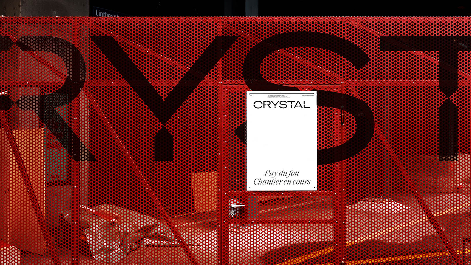
CRYSTAL’s identity had to be iconic: we knew that the creation of their new branding would be as challenging as their day-to-day exploits. With this in mind, we crafted a custom font which led to the creation of a hard-hitting logo and visual system that would be recognisable on any media, in any language, in any context. Whether applied monumentally to a shipping container in Dubai or discreetly to a t-shirt in the company’s workshop in the Paris suburbs, the CRYSTAL signature is intended to become a classic.
We delved into more than twenty years of archives in order to grasp CRYSTAL’s true personality, and to convey it in the best possible way. In addition to this, we followed our in-depth methodology to produce a fitting, forward-thinking verbal identity, providing the client with a communications charter to follow, from the creation of their new slogan “Dedicated to emotion”, the tagline “Designers and producers of spectacular moments since 1998”, and how to use them efficiently down to the minute details of capitalisation, punctuation use, and numbering.
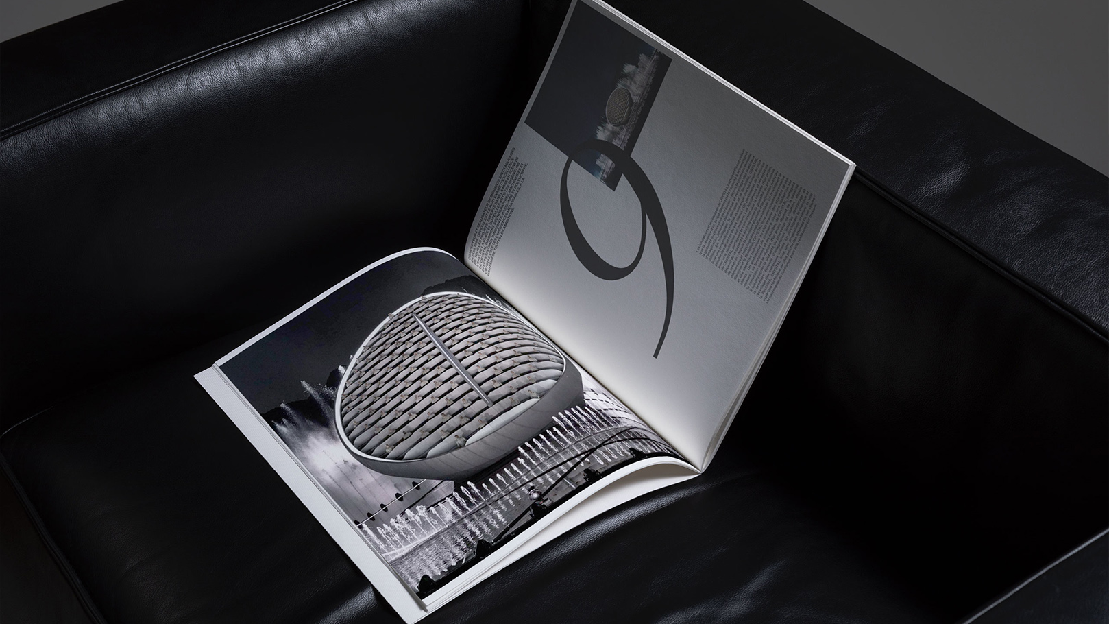
Over a year-long period, we slowly unveiled the new CRYSTAL, covering all communications channels and media. We began with a visual charter that comprises their logo, typefaces, colours, and utilisation guidelines. In concert with CRYSTAL’s internal communications team, we established an image production guide which allows them to capture both the inner workings of the ateliers, as well as the production of sleek, finalised product photography destined for their website or promotional material.
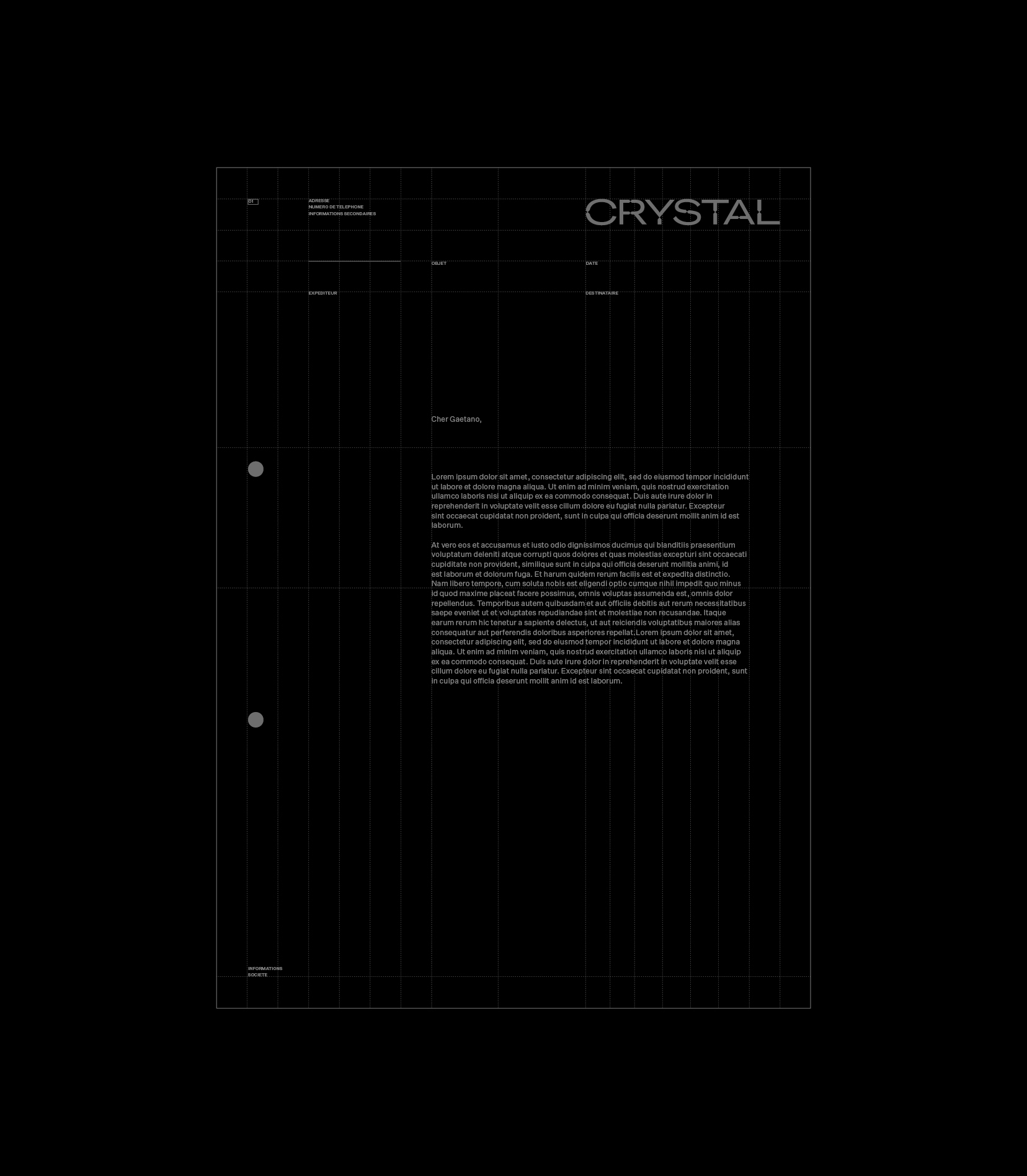
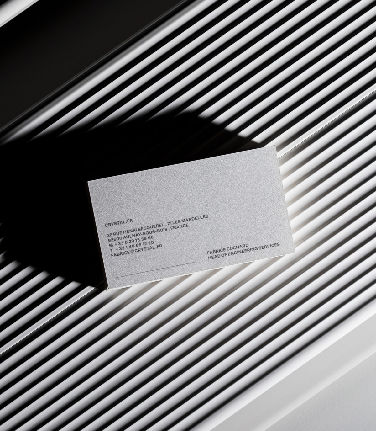
We then entirely rethought the CRYSTAL.FR website using the visual identity as a brand bible, applying each rule meticulously in order to translate CRYSTAL’s complex mission and ambitions. Under the artistic direction of Stoëmp, this included not only the production of animations and 3D renderings, but also the creation of an experimental journal that captures CRYSTAL’s innovations and patents under the section “CRYSTAL LAB”. The website was then developed by CRYSTAL’s partner company, Digital Reserve. In a third and final phase, we rolled out printed and digital communication tools such as portfolios, PowerPoint and Keynote presentations, and various merchandising, all in harmony with CRYSTAL’s new image as expert creators of emotion.
The Stoëmp promise: where brands find themselves
The challenge here was notable: how were we to reposition a company that had successfully flourished over the past two decades with the same strategy and visual identity? How were we to shake up their (bad) habits, question the groove they had fallen into, and eventually offer a clearer vision of who they are? Our numerous workshops and methods based upon exchanges between Stoëmp and CRYSTAL led to a fruitful collaboration and a surpassing of all expectations on both sides.
Despite a challenging context of working with Covid constraints, multiple zoom calls, masked train journeys between our agency in Brussels and their workshops in Paris, we instilled a sense of camaraderie and a true understanding which was felt right up until the launch moment, and beyond.
