Rebrand of Real Clean
for Real Techniques, U.S. beauty leader,
preserving the masterbrand’s
DNA throughout.
-
+ Context & collaboration
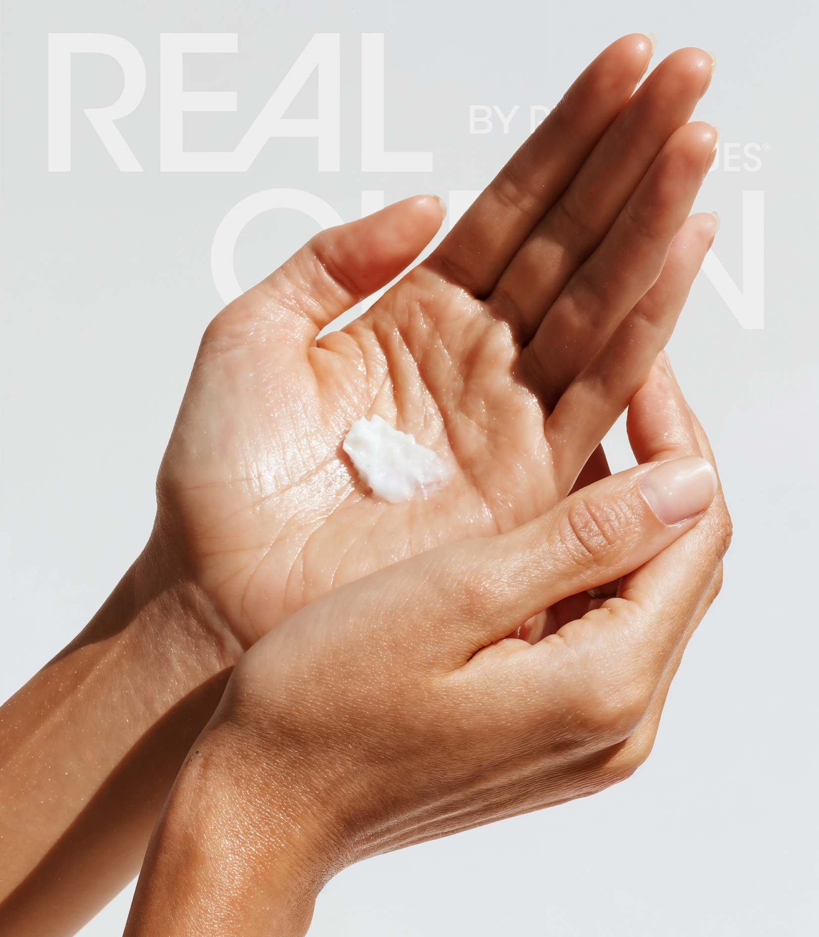
Real Clean is a product line from Real Techniques, a leading U.S. cosmetics brand headquartered in Chicago. In collaboration with Wildvertising, we delivered a rebrand that strengthens the line while staying fully coherent with the parent brand..
+ Branding, not repainting
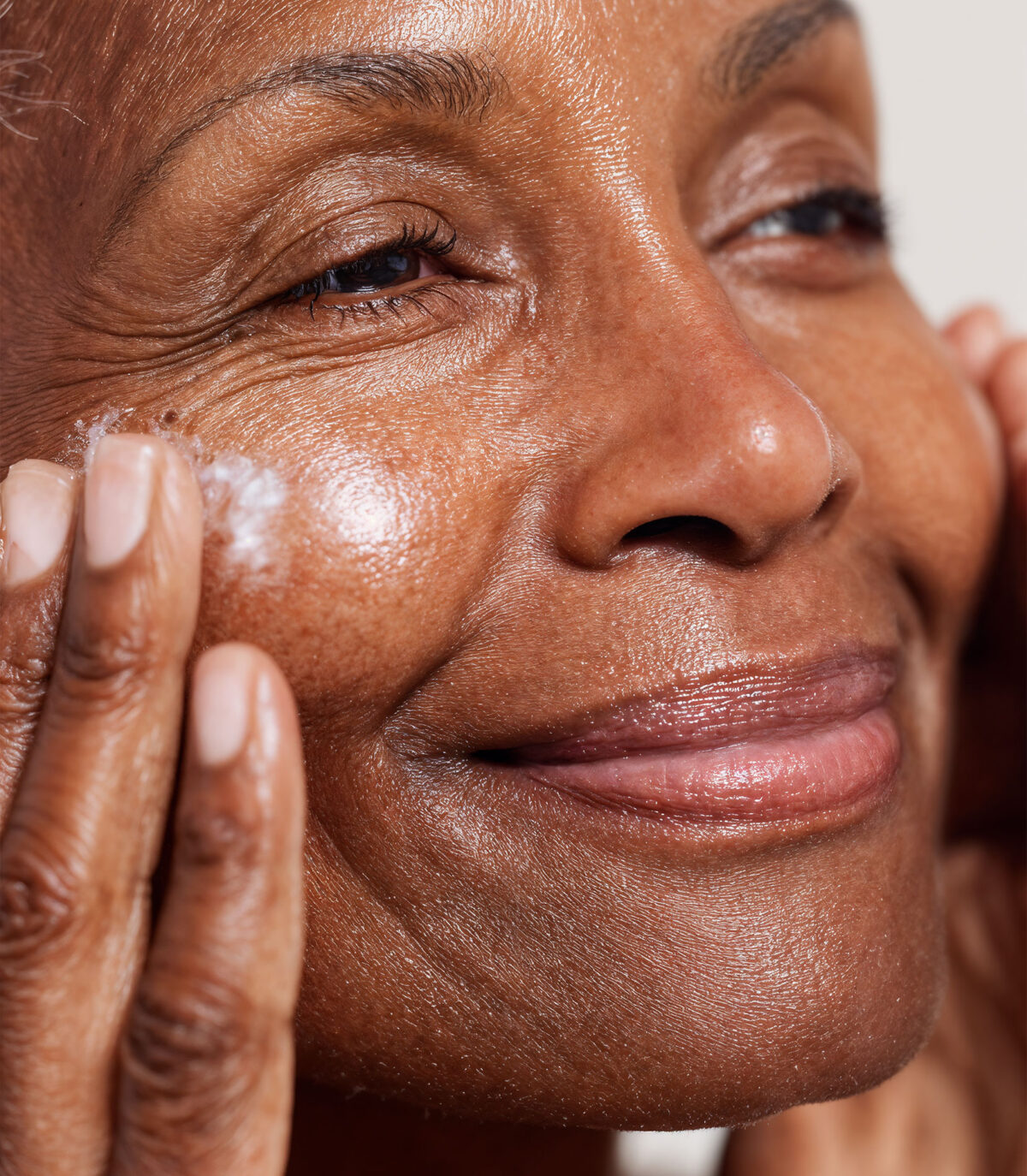
Our brief: elevate the range without breaking recognition. We refined the range identity so it feels unmistakably Real Techniques—tone, typography, proportion—while giving Real Clean a clear voice of its own (benefit-first, routine-friendly, straight to the point)..
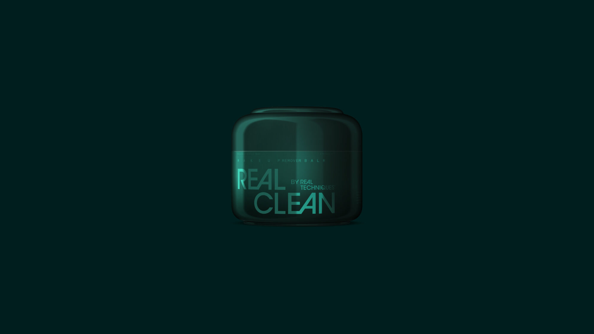
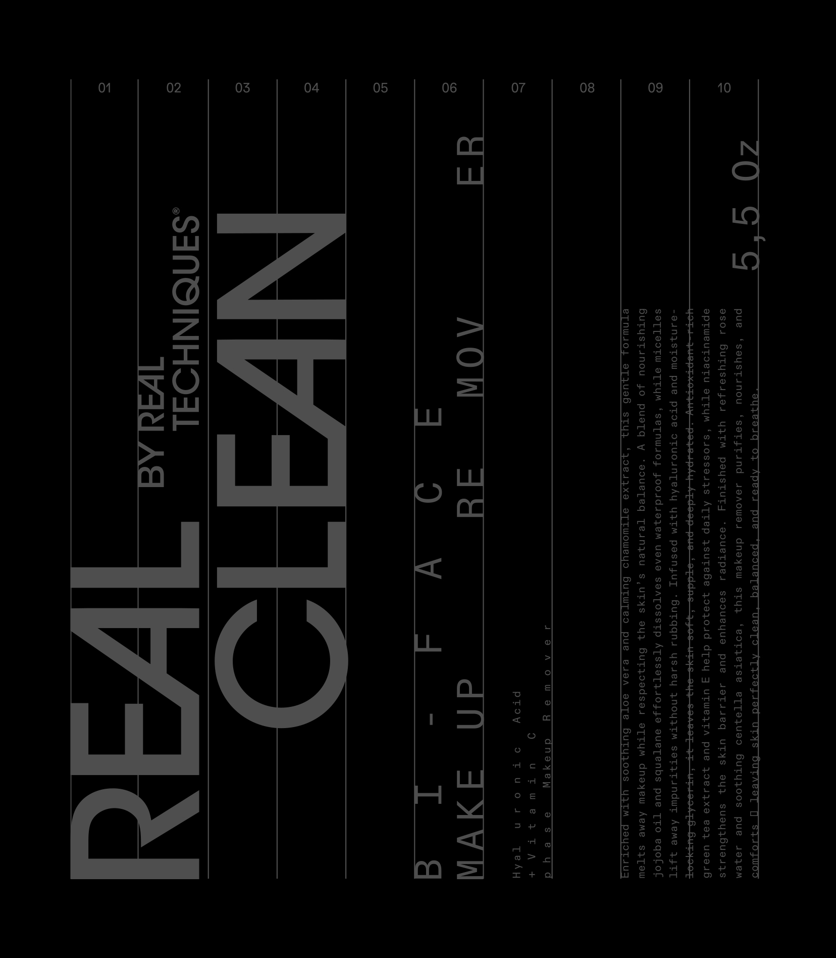
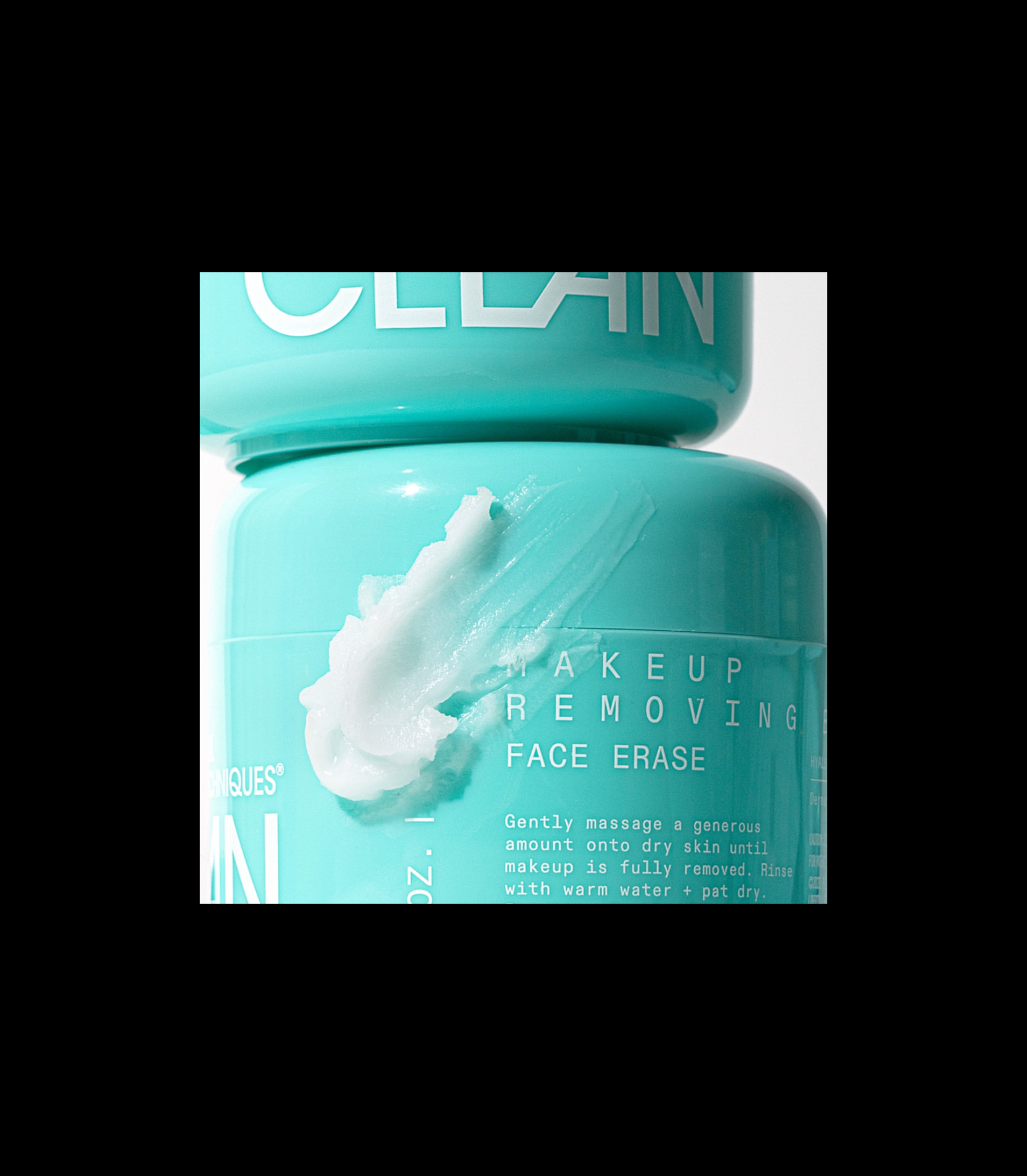
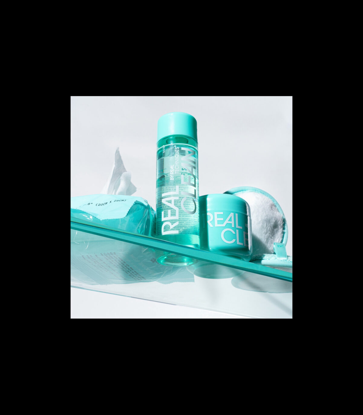
+ Packaging for the U.S. shelf
We designed packaging that reads fast in retail and e-commerce:-
Front-of-pack hierarchy: line name → key benefit → usage.
-
Color-coding: immediate SKU differentiation without losing brand cohesion.
-
Claims & icons: organized for quick scanning; compliant, legible, and brand-consistent.
-
Back-of-pack clarity: concise instructions and essentials formatted for U.S. shoppers.
Result: strong shelf impact, easy recognition, and zero confusion between SKUs.
.
+ Range guidelines for scale
To make growth effortless, we built line guidelines: typography ramps, color logic, claims architecture, iconography, layout grids, and asset templates. The toolkit enables rapid extensions and retailer-ready adaptations — ready to roll out nationwide across supermarkets, drugstores, and online..
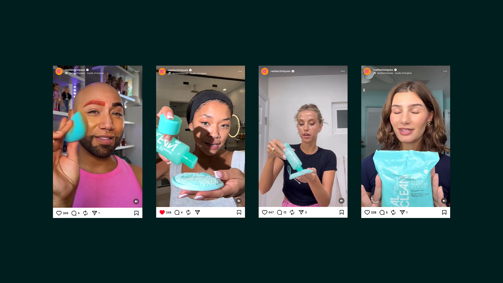
+ Designed for the American market
Visual codes were tuned for the U.S.: bold benefit hierarchy, clear contrast, imperial units where relevant, and packaging structures that perform in planograms and thumbnails alike. It’s graphic, readable, and conversion-minded — from aisle to app..
+ Outcome
A coherent, brand-aligned Real Clean identity, packaging that works as hard as it looks, and a guideline system that turns launches into a repeatable process — the kind retailers love and shoppers recognize across the United States. -
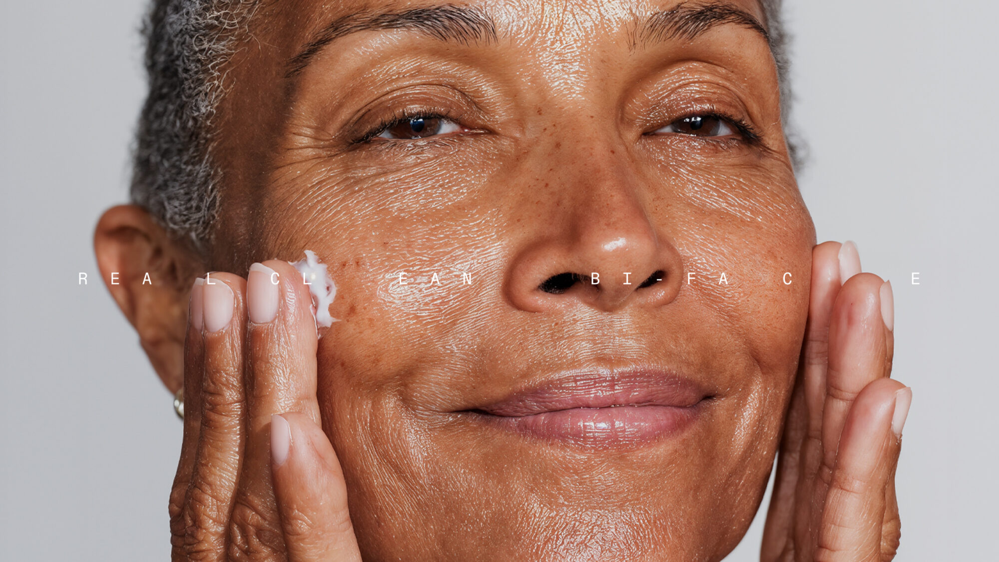
Real Clean
Fashion & Beauty
A product identity and packaging system
that stands out on shelf, yet locks perfectly to
the Real Techniques masterbrand.
Line guidelines built for scale
plug-and-play rules that will speed
go-to-market across major U.S. retailers.
Next Project
Alexandre Hekkers, Fashion
Alexandre Hekkers, Fashion

+ Context & collaboration
Real Clean is a product line from Real Techniques, a leading U.S. cosmetics brand headquartered in Chicago. In collaboration with Wildvertising, we delivered a rebrand that strengthens the line while staying fully coherent with the parent brand.
.
+ Branding, not repainting
Our brief: elevate the range without breaking recognition. We refined the range identity so it feels unmistakably Real Techniques—tone, typography, proportion—while giving Real Clean a clear voice of its own (benefit-first, routine-friendly, straight to the point).
.
+ Packaging for the U.S. shelf
We designed packaging that reads fast in retail and e-commerce:
-
Front-of-pack hierarchy: line name → key benefit → usage.
-
Color-coding: immediate SKU differentiation without losing brand cohesion.
-
Claims & icons: organized for quick scanning; compliant, legible, and brand-consistent.
-
Back-of-pack clarity: concise instructions and essentials formatted for U.S. shoppers.
Result: strong shelf impact, easy recognition, and zero confusion between SKUs.
.
+ Range guidelines for scale
To make growth effortless, we built line guidelines: typography ramps, color logic, claims architecture, iconography, layout grids, and asset templates. The toolkit enables rapid extensions and retailer-ready adaptations — ready to roll out nationwide across supermarkets, drugstores, and online.
.
+ Designed for the American market
Visual codes were tuned for the U.S.: bold benefit hierarchy, clear contrast, imperial units where relevant, and packaging structures that perform in planograms and thumbnails alike. It’s graphic, readable, and conversion-minded — from aisle to app.
.
+ Outcome
A coherent, brand-aligned Real Clean identity, packaging that works as hard as it looks, and a guideline system that turns launches into a repeatable process — the kind retailers love and shoppers recognize across the United States.