A brand that reads like a fashion magazine.
-
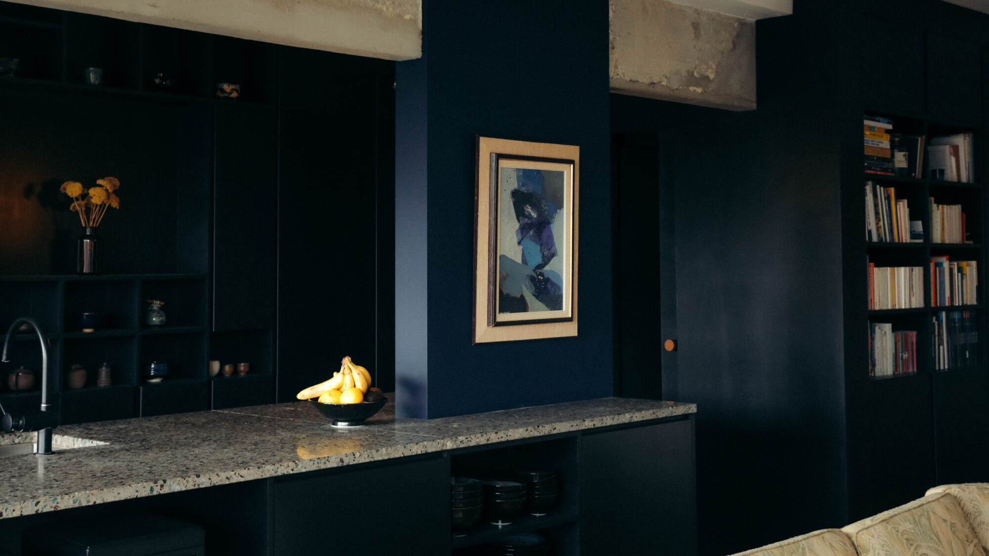
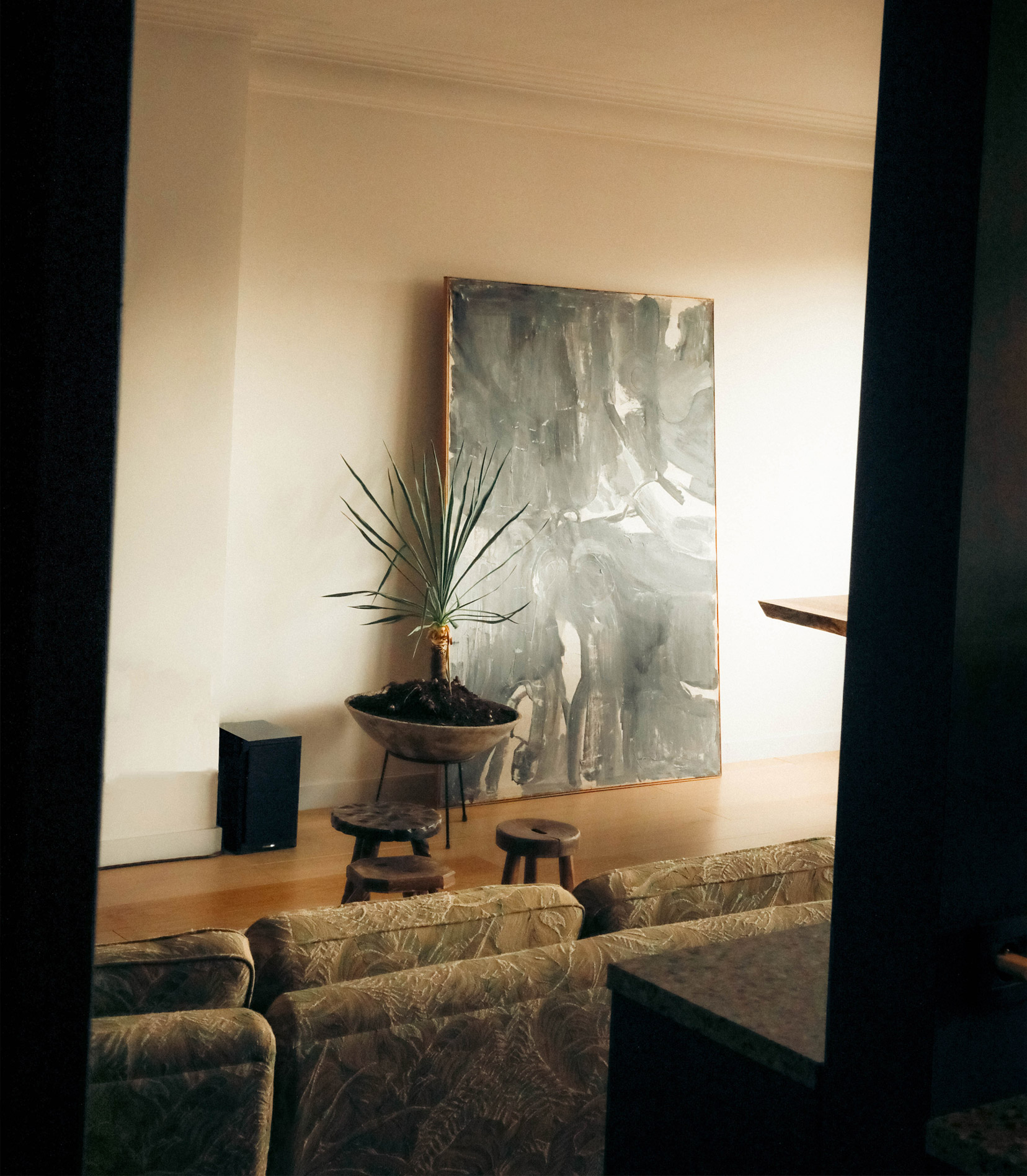
+ Fashion editorial, applied to a studio
Leonet Hoang is a rare duo: architects and antique dealers. Their world is sharply curated — projects, objects, and atmospheres with surgical taste. We built a brand that behaves like a fashion magazine: confident, edited, and instantly legible across print and digital..
+ Strategy: curation as conversion
The core move was strategic: use the antique-dealer side as a conversion lever toward architectural commissions. The logic is simple — if you trust their eye for objects, you’ll trust their vision for space. We positioned them top-of-mind for both interiors and architecture, with content and journeys that escort followers from liking an object to briefing a project..
+ Verbal identity: precise, elegant, human
We crafted a verbal identity that speaks like an editor and welcomes like a host: concise lines, clear benefits, zero fluff. Product copy is factual and collectible-minded; project copy is pared-back, materials-first; captions carry the brand’s point of view without shouting..
+ Custom logo font: a signature you can’t miss
We drew a bespoke font — an elegant grotesque with a fashion-house inflection. It’s used delicately and sparingly — a signature, not a shout — so the editorial system and imagery keep the spotlight.
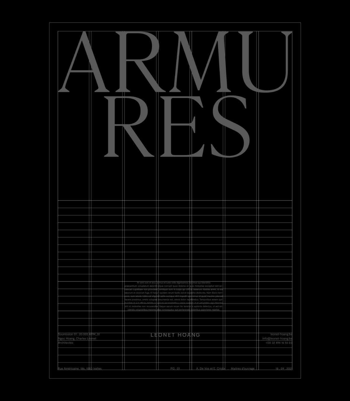
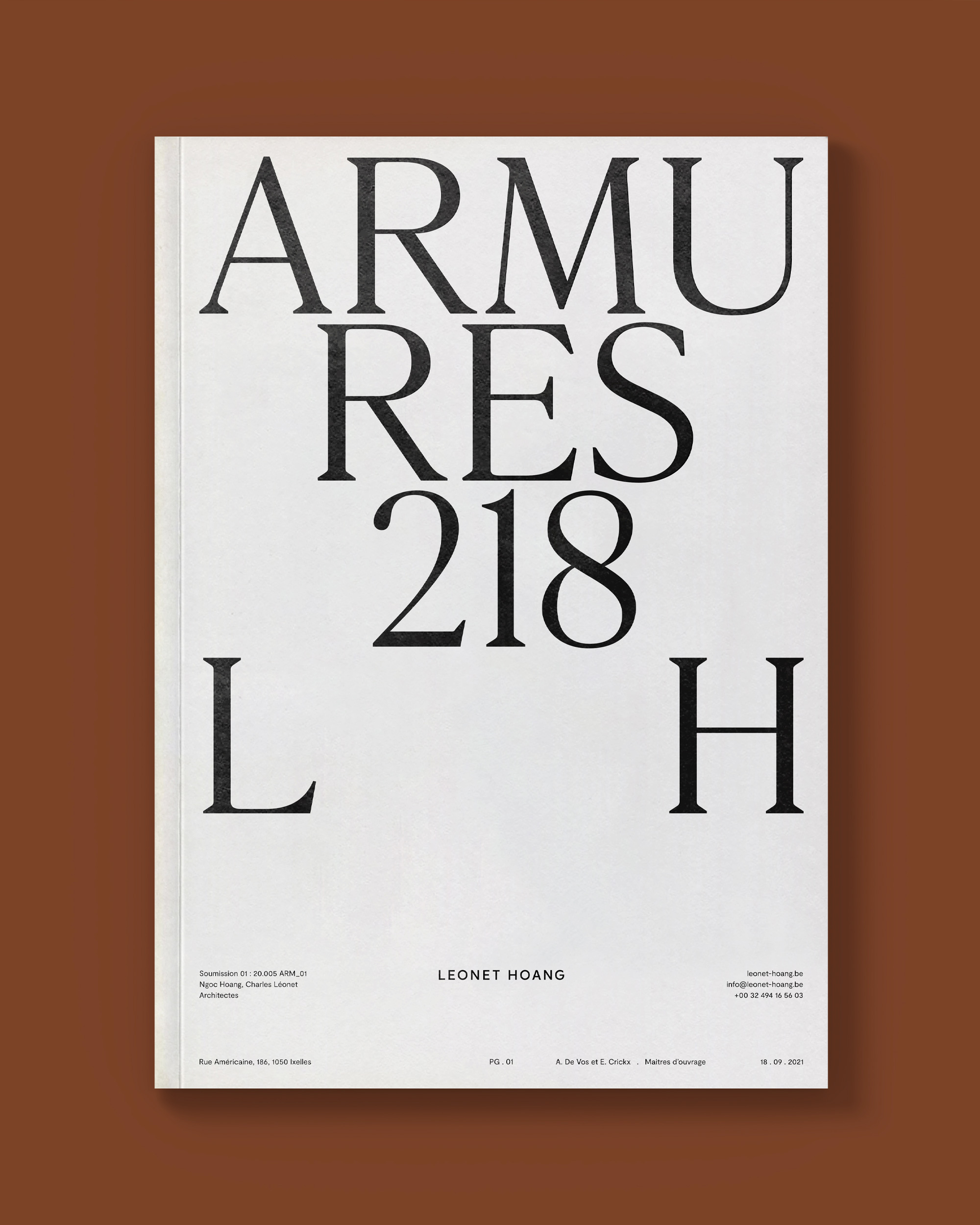
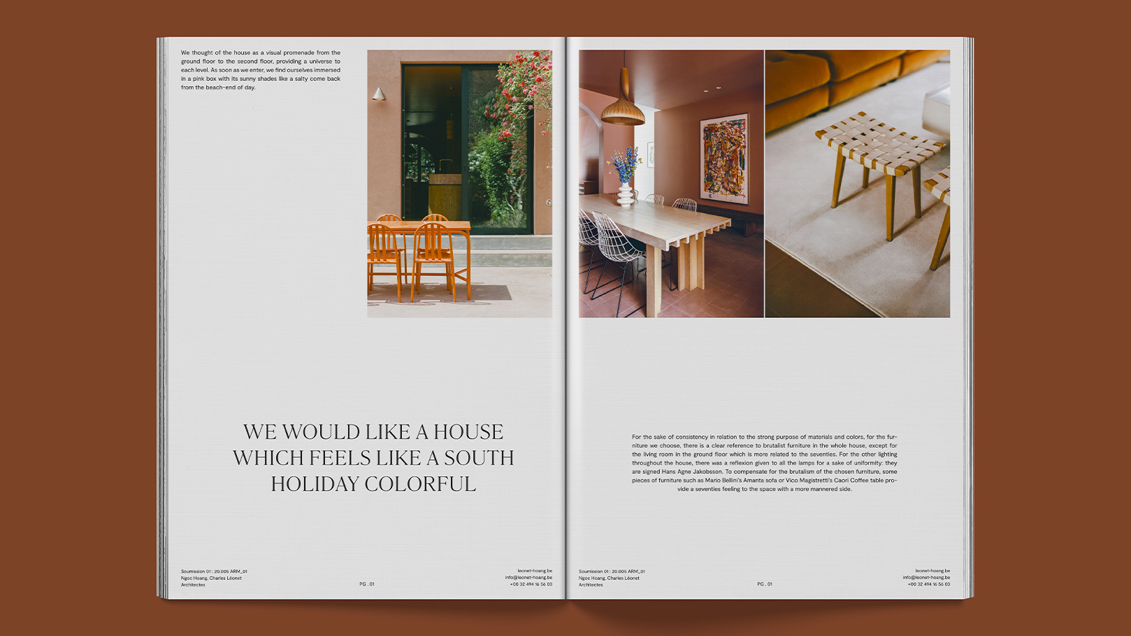
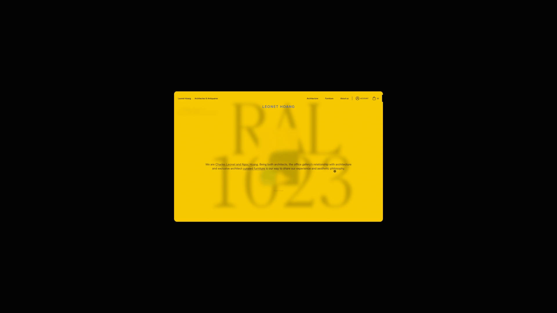
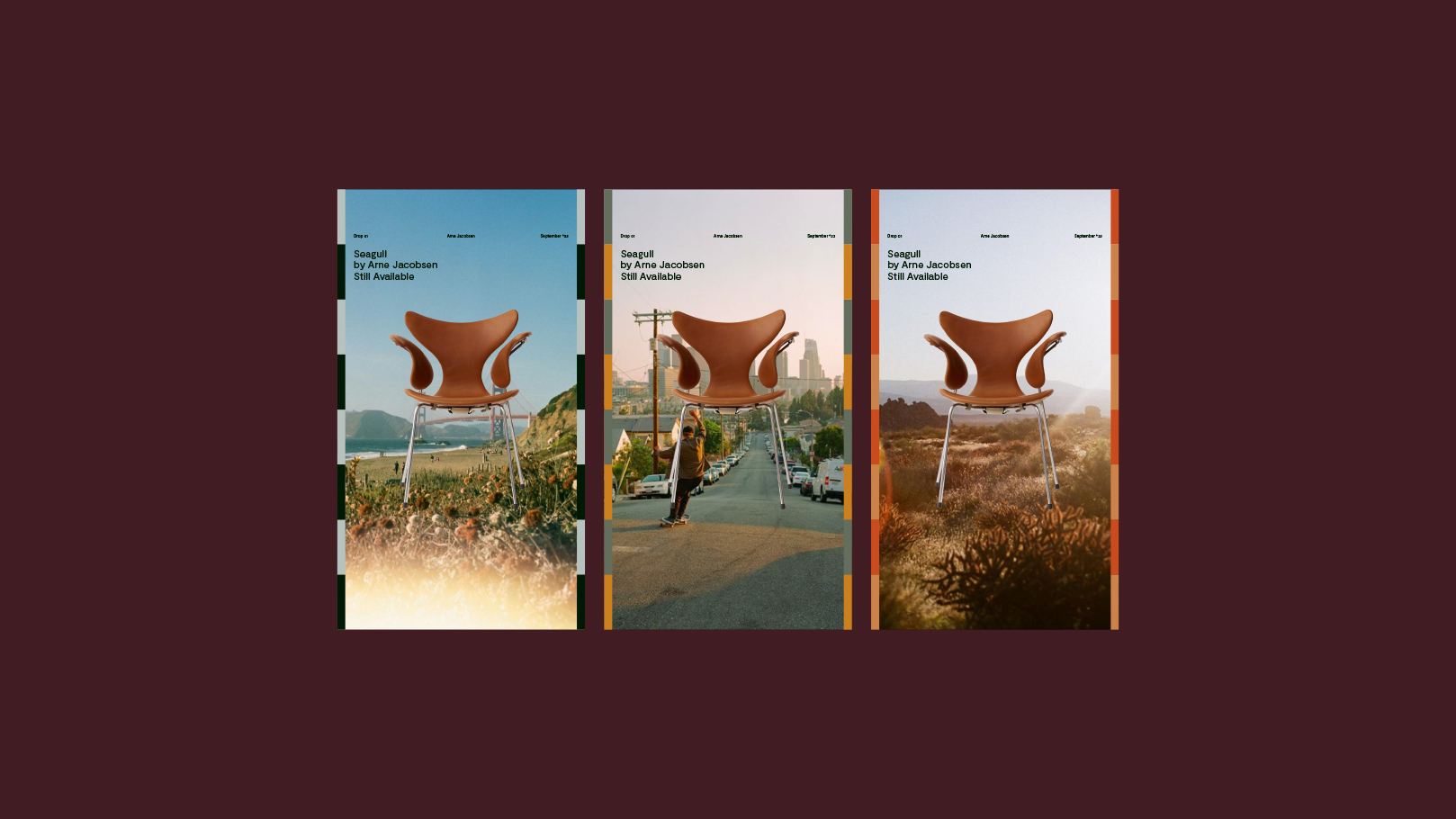
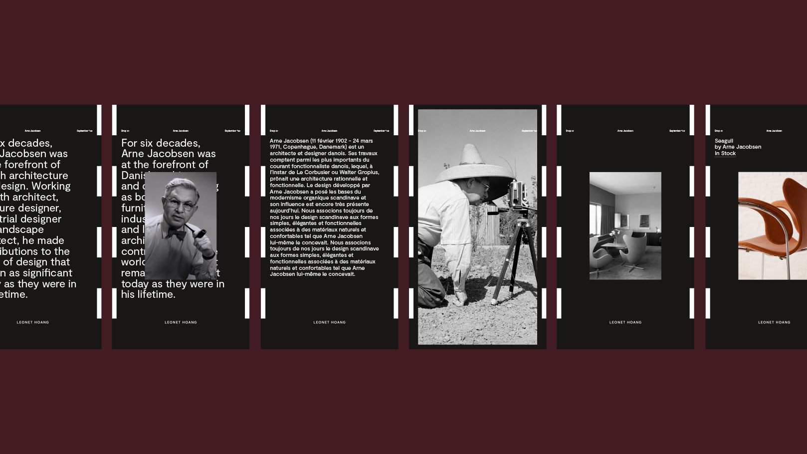
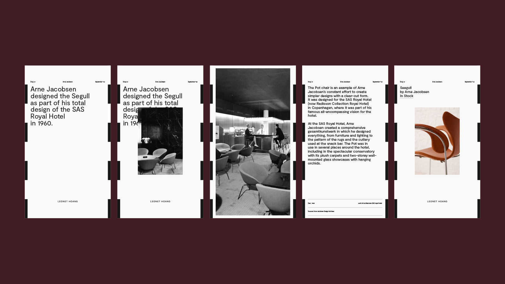
.+ Editorial system: big type, strict grids
The brand system borrows magazine tools: oversized serif headlines, strict grids, white space with intention, and image crops that feel curated rather than decorative. The result is lifestyle energy without lifestyle vagueness..
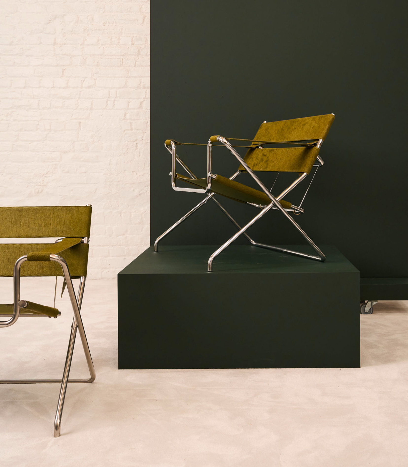
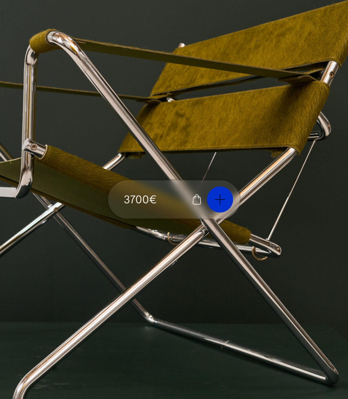
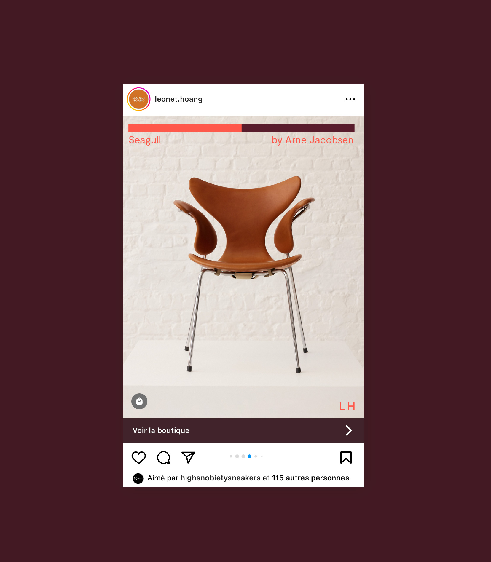
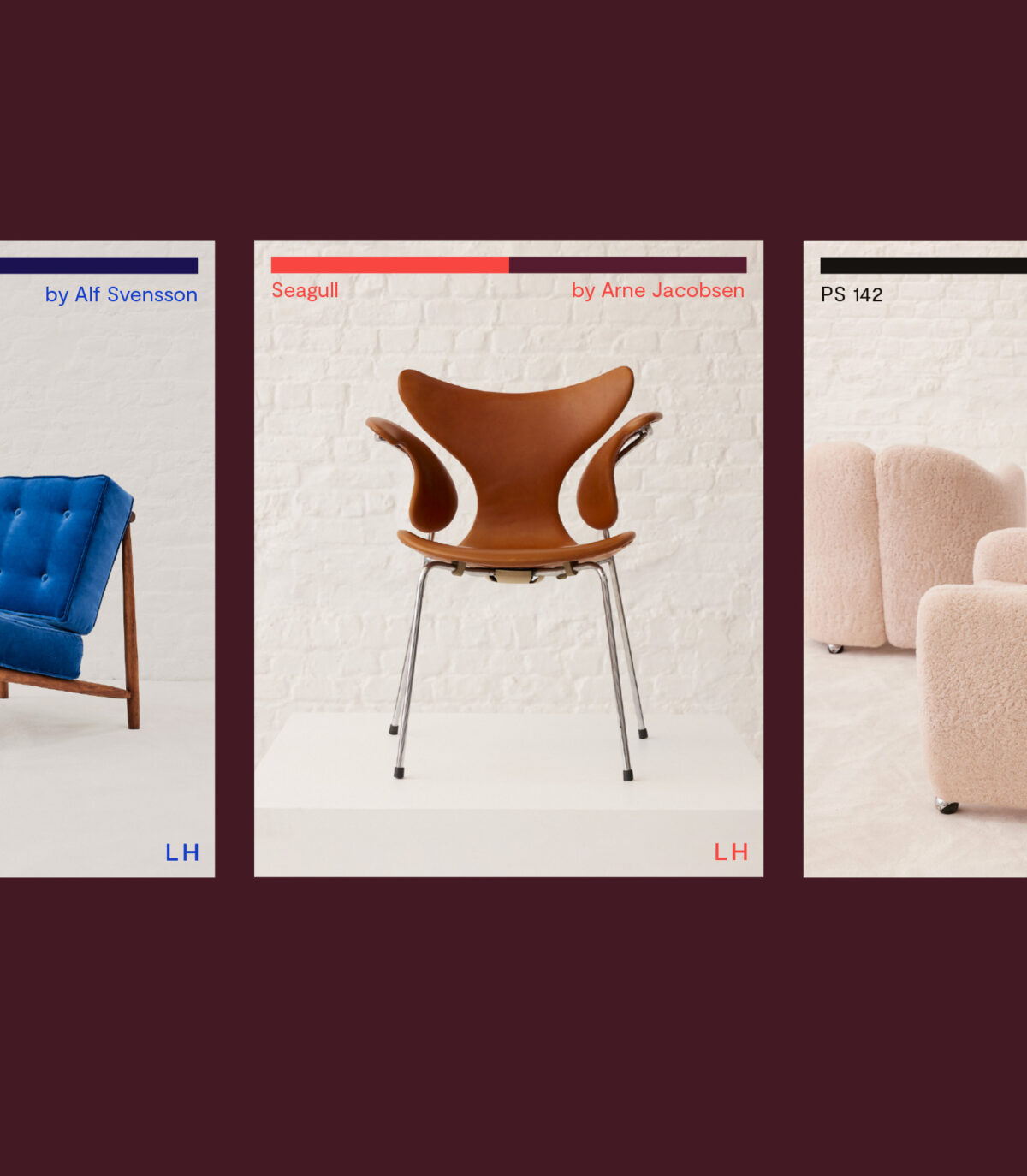
+ Digital design: tailored site + e-shop
We designed a polished website with an e-shop to grow sales and capture demand. Clear taxonomy (designer, typology, era), fast filters, and generous product imagery make browsing addictive. Frictionless actions — save, enquire, book a showroom visit — turn interest into movement..
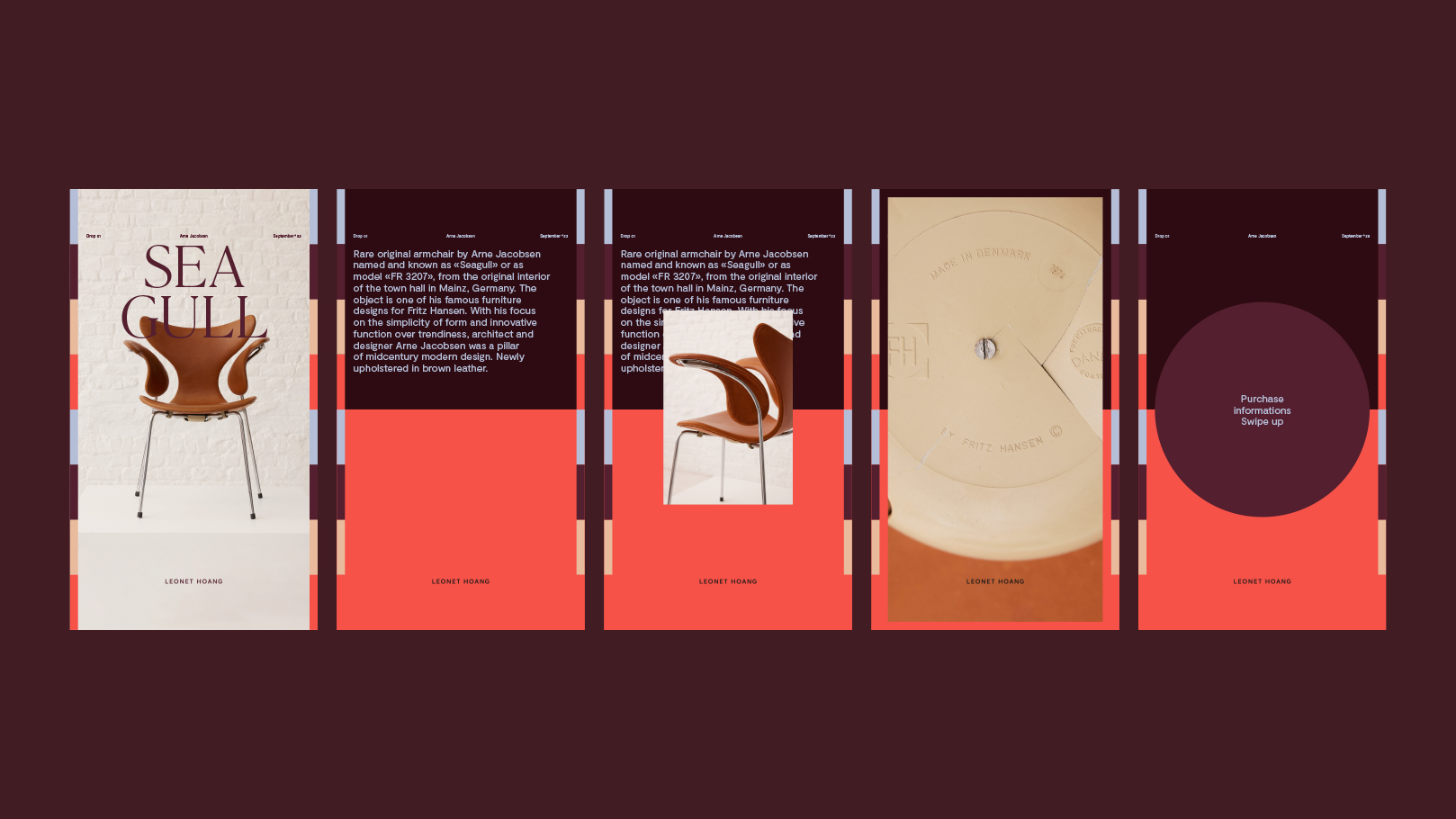
+ Social strategy: from feed to lead (the technical bit)
We built a performance-minded editorial calendar with three pillars:-
Objects/Finds (velocity, desire),
-
Projects/Process (authority, craft),
-
Signals/Culture (taste, relevance).
Formats are optimized for reach (reels, motion), for save/share (carousels, checklists), and for click-through (story CTAs, product tags). Links drive to product pages or project enquiry; UTM tagging and pixels enable retargeting (viewed product → showroom invite; saved post → consult). Newsletter capture and favourites lists keep warm leads alive.
.
+ Funnel design: desire → dialogue → project
Every touchpoint has a job: social builds desire, the e-shop proves taste at price point, the site converts interest into visits and briefs. The antique-dealer pulse fuels daily traction; architecture wins on depth and trust..
+ Outcome by design
A brand that feels like an editorial title, a platform that behaves like a sales engine, and a voice that moves people from admiration to action. Leonet Hoang stays elegant on the surface — and unmistakably point-sharp underneath. -
Leonet Hoang
Design & Architecture
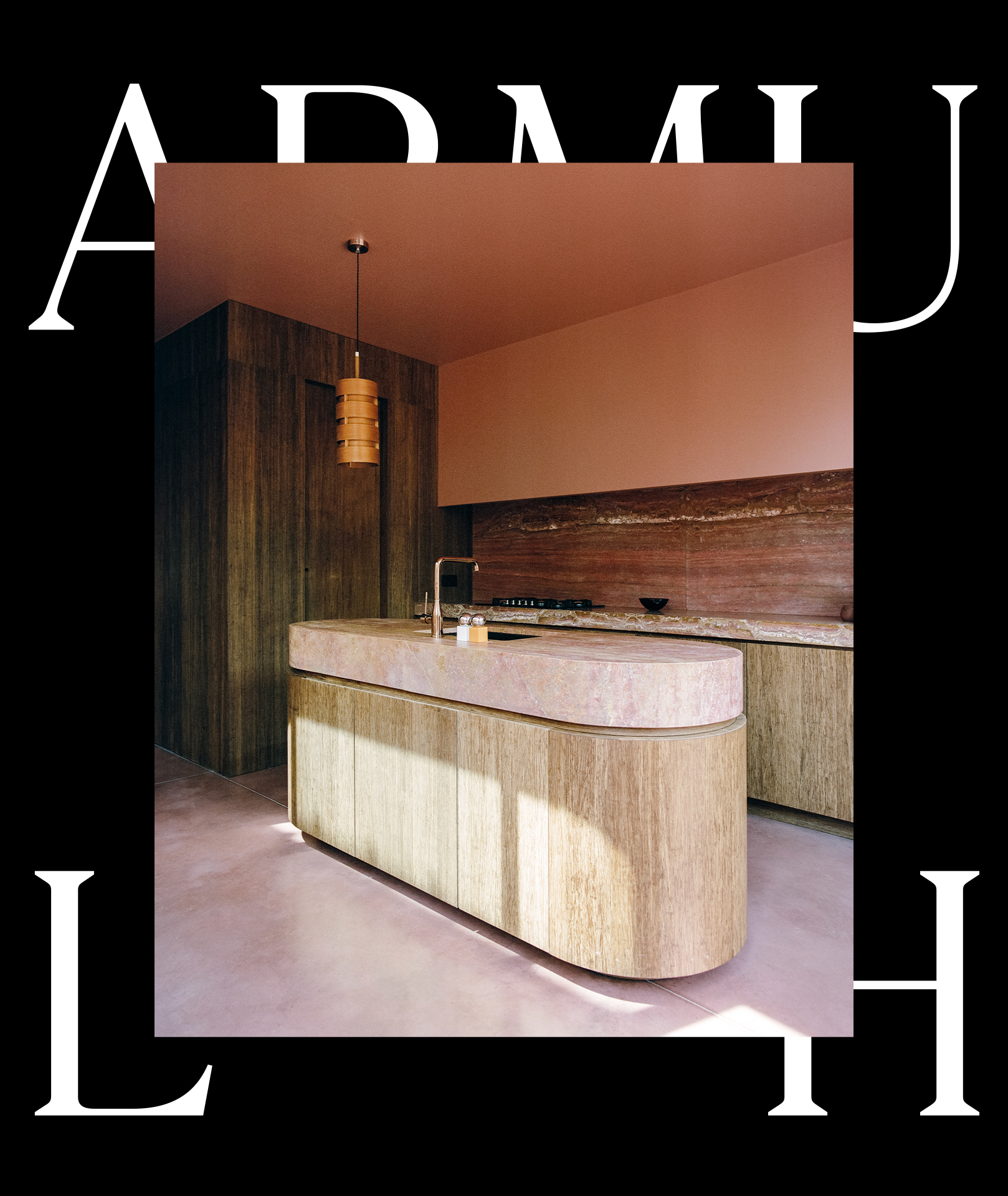
Oversized serif headlines create
an editorial hierarchy visible at a glance.
Scale becomes the brand signature,
guiding the eye across grid, image,
and caption without shouting.
The e-shop doubles as a showroom index:
transparent price points build trust,
while side-by-side recommendations
connect objects to interior and
architectural services.
Every touchpoint has a job:
social builds desire, the e-shop proves
taste at price point, the site converts interest
into visits and briefs.
Next Project
Le Rideau *25.26, Arts & Culture
Le Rideau *25.26, Arts & Culture
+ Fashion editorial, applied to a studio
Leonet Hoang is a rare duo: architects and antique dealers. Their world is sharply curated — projects, objects, and atmospheres with surgical taste. We built a brand that behaves like a fashion magazine: confident, edited, and instantly legible across print and digital.
.
+ Strategy: curation as conversion
The core move was strategic: use the antique-dealer side as a conversion lever toward architectural commissions. The logic is simple — if you trust their eye for objects, you’ll trust their vision for space. We positioned them top-of-mind for both interiors and architecture, with content and journeys that escort followers from liking an object to briefing a project.
.
+ Verbal identity: precise, elegant, human
We crafted a verbal identity that speaks like an editor and welcomes like a host: concise lines, clear benefits, zero fluff. Product copy is factual and collectible-minded; project copy is pared-back, materials-first; captions carry the brand’s point of view without shouting.
.
+ Custom logo font: a signature you can’t miss
We drew a bespoke font — an elegant grotesque with a fashion-house inflection. It’s used delicately and sparingly — a signature, not a shout — so the editorial system and imagery keep the spotlight.
.
+ Editorial system: big type, strict grids
The brand system borrows magazine tools: oversized serif headlines, strict grids, white space with intention, and image crops that feel curated rather than decorative. The result is lifestyle energy without lifestyle vagueness.
.
+ Digital design: tailored site + e-shop
We designed a polished website with an e-shop to grow sales and capture demand. Clear taxonomy (designer, typology, era), fast filters, and generous product imagery make browsing addictive. Frictionless actions — save, enquire, book a showroom visit — turn interest into movement.
.
+ Social strategy: from feed to lead (the technical bit)
We built a performance-minded editorial calendar with three pillars:
-
Objects/Finds (velocity, desire),
-
Projects/Process (authority, craft),
-
Signals/Culture (taste, relevance).
Formats are optimized for reach (reels, motion), for save/share (carousels, checklists), and for click-through (story CTAs, product tags). Links drive to product pages or project enquiry; UTM tagging and pixels enable retargeting (viewed product → showroom invite; saved post → consult). Newsletter capture and favourites lists keep warm leads alive.
.
+ Funnel design: desire → dialogue → project
Every touchpoint has a job: social builds desire, the e-shop proves taste at price point, the site converts interest into visits and briefs. The antique-dealer pulse fuels daily traction; architecture wins on depth and trust.
.
+ Outcome by design
A brand that feels like an editorial title, a platform that behaves like a sales engine, and a voice that moves people from admiration to action. Leonet Hoang stays elegant on the surface — and unmistakably point-sharp underneath.