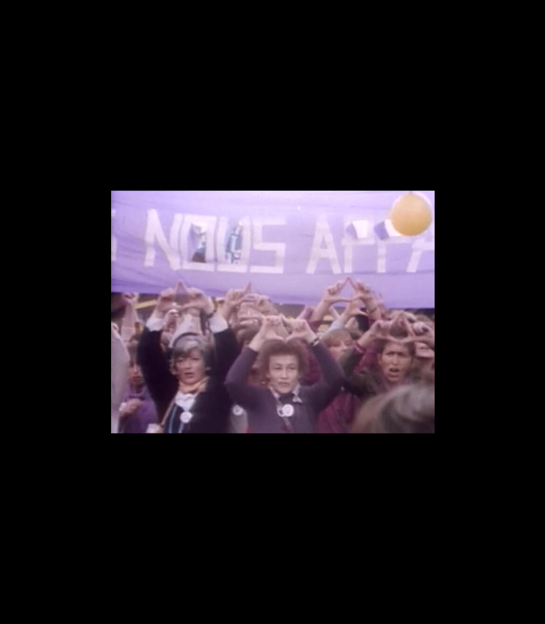
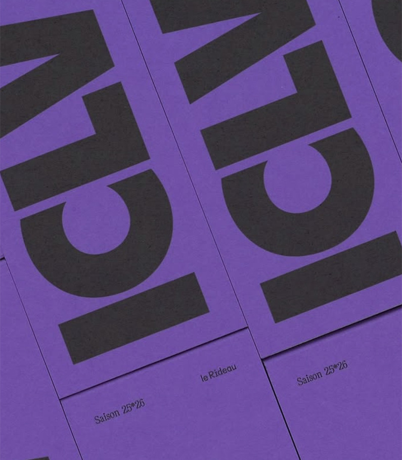
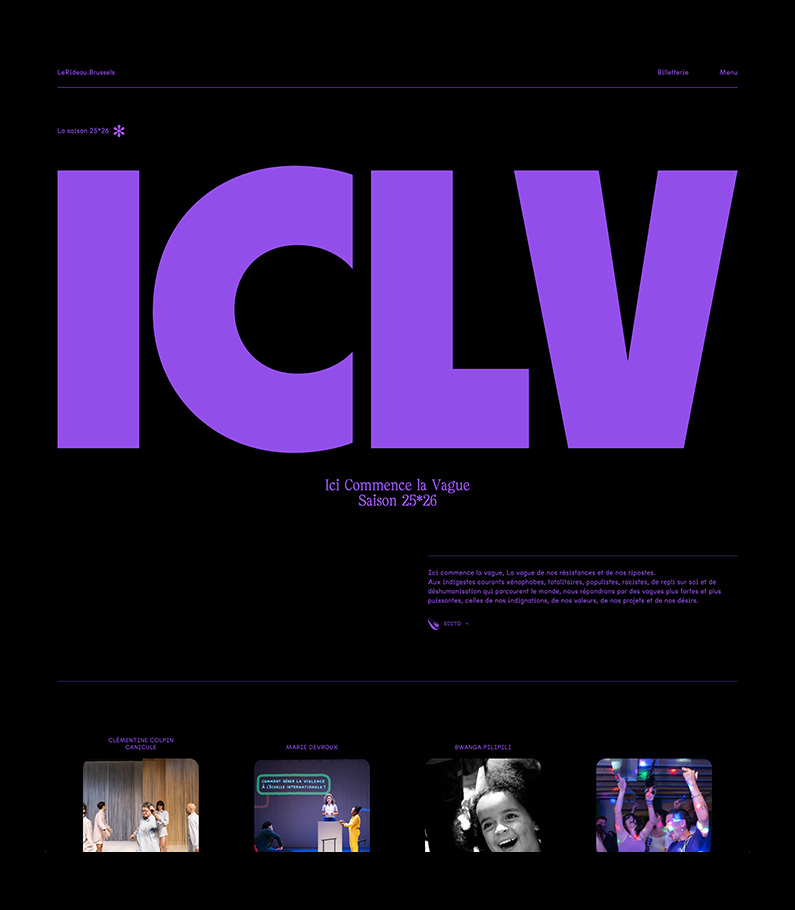
“Ici Commence La Vague”
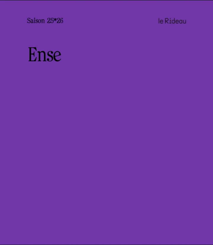
suffragette purple carries the season’s call to action.
-
+ Purple with a purpose
For Le Rideau’s new season, we chose a single, unflinching signal: suffragette purple. Not a mood, a message. The color threads the entire campaign — print, digital, motion — as a tribute to those who fought for a voice, and an invitation to use it now..
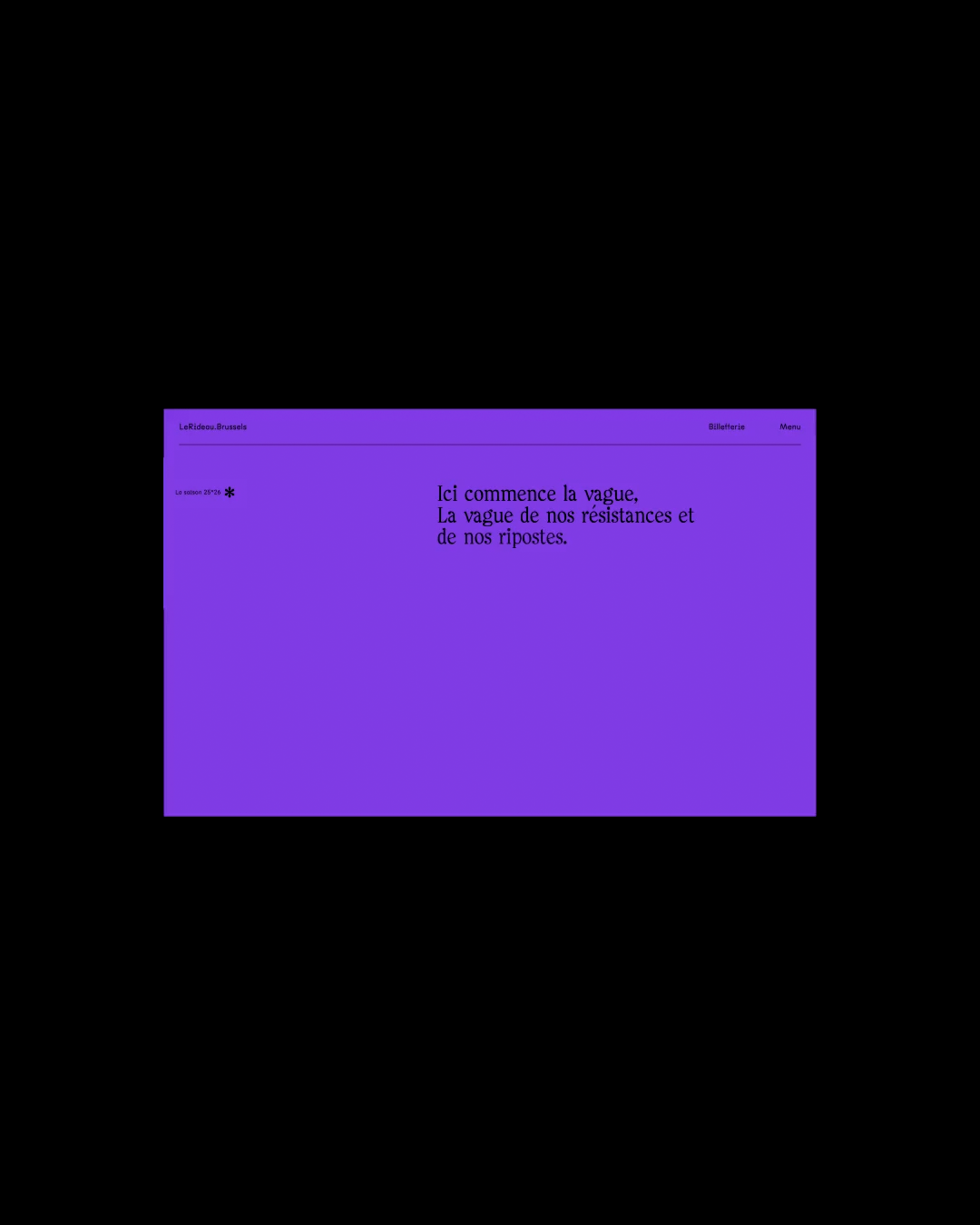
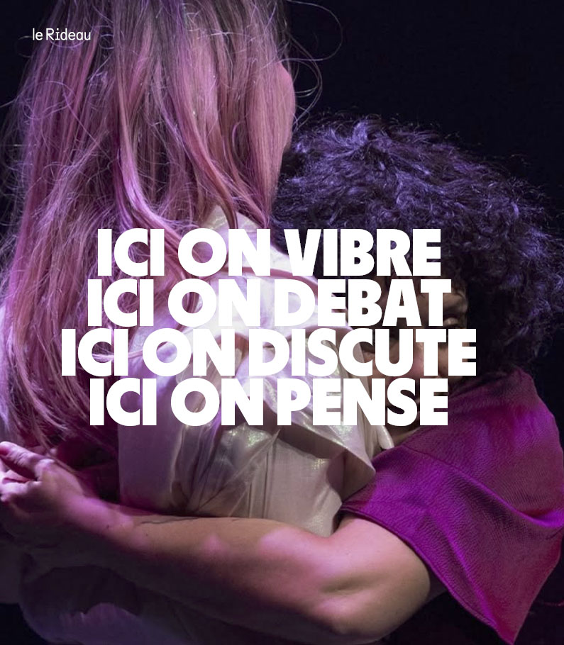
+ Design that hits hard — and means something
We set out to combine strong form with clear intent. Bold layouts grab attention; the narrative beneath gives it weight. Form gets you to stop; meaning makes you stay. Every asset balances urgency and dignity, avoiding nostalgia while honoring the movement’s legacy..
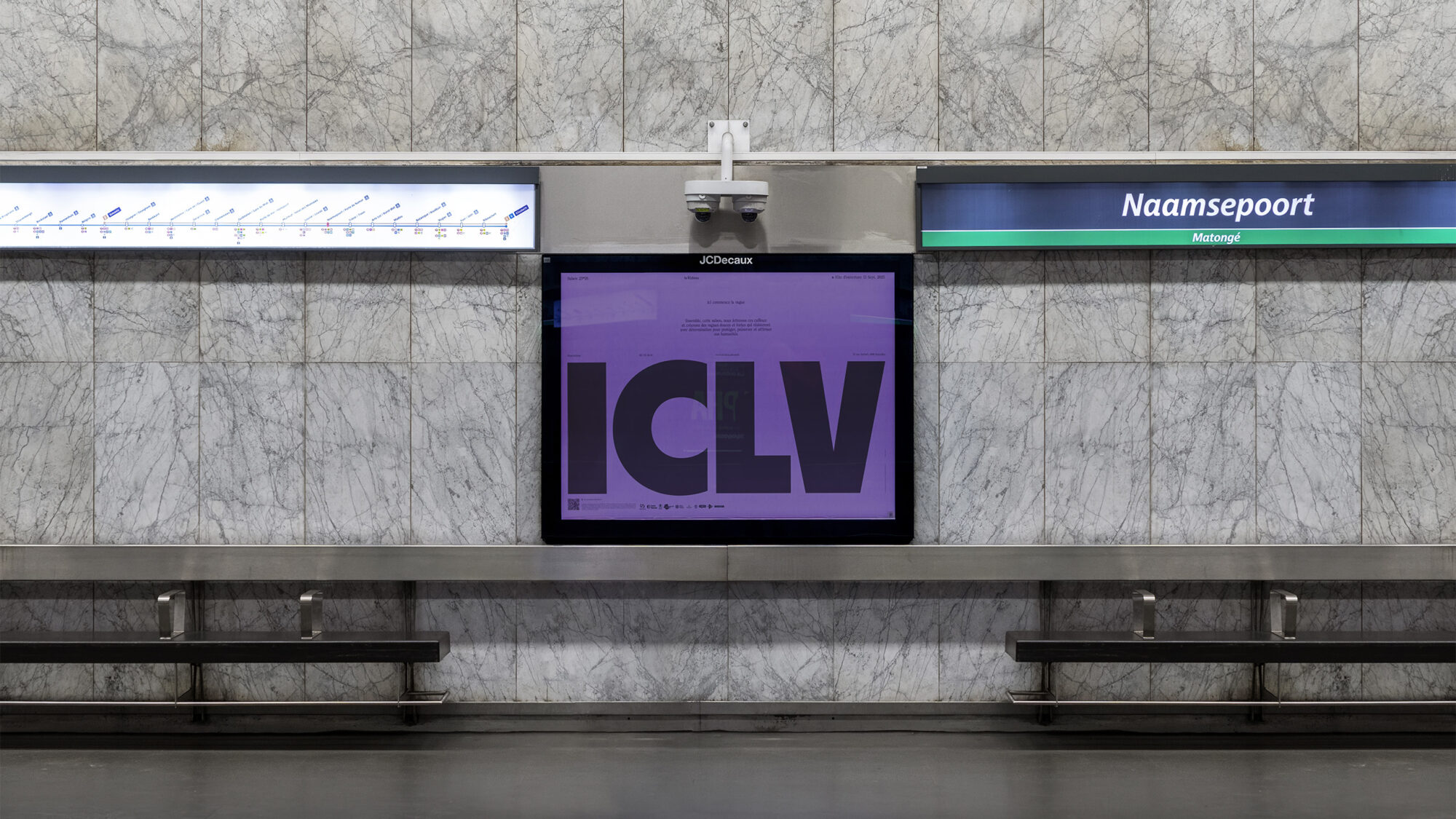
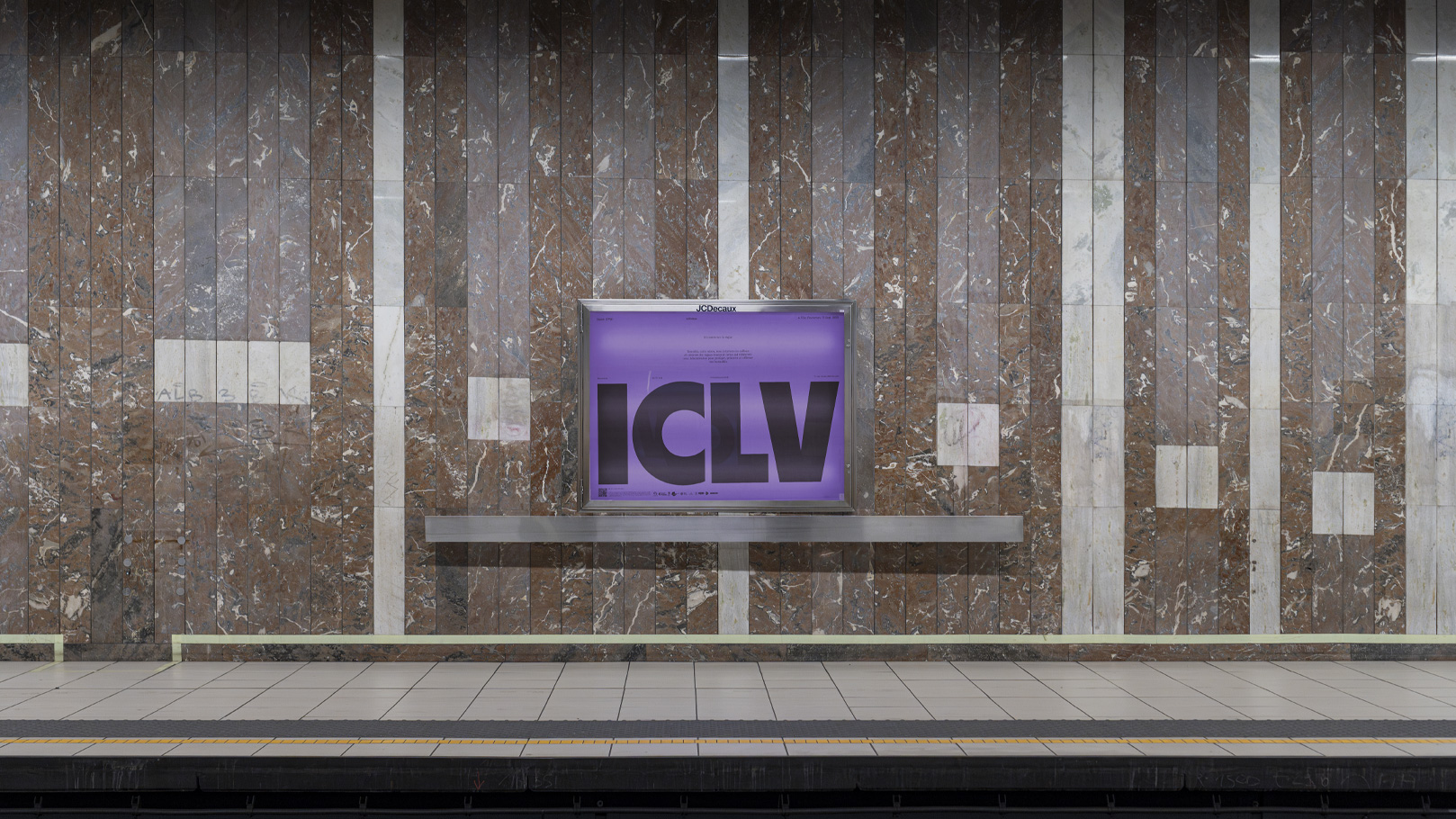
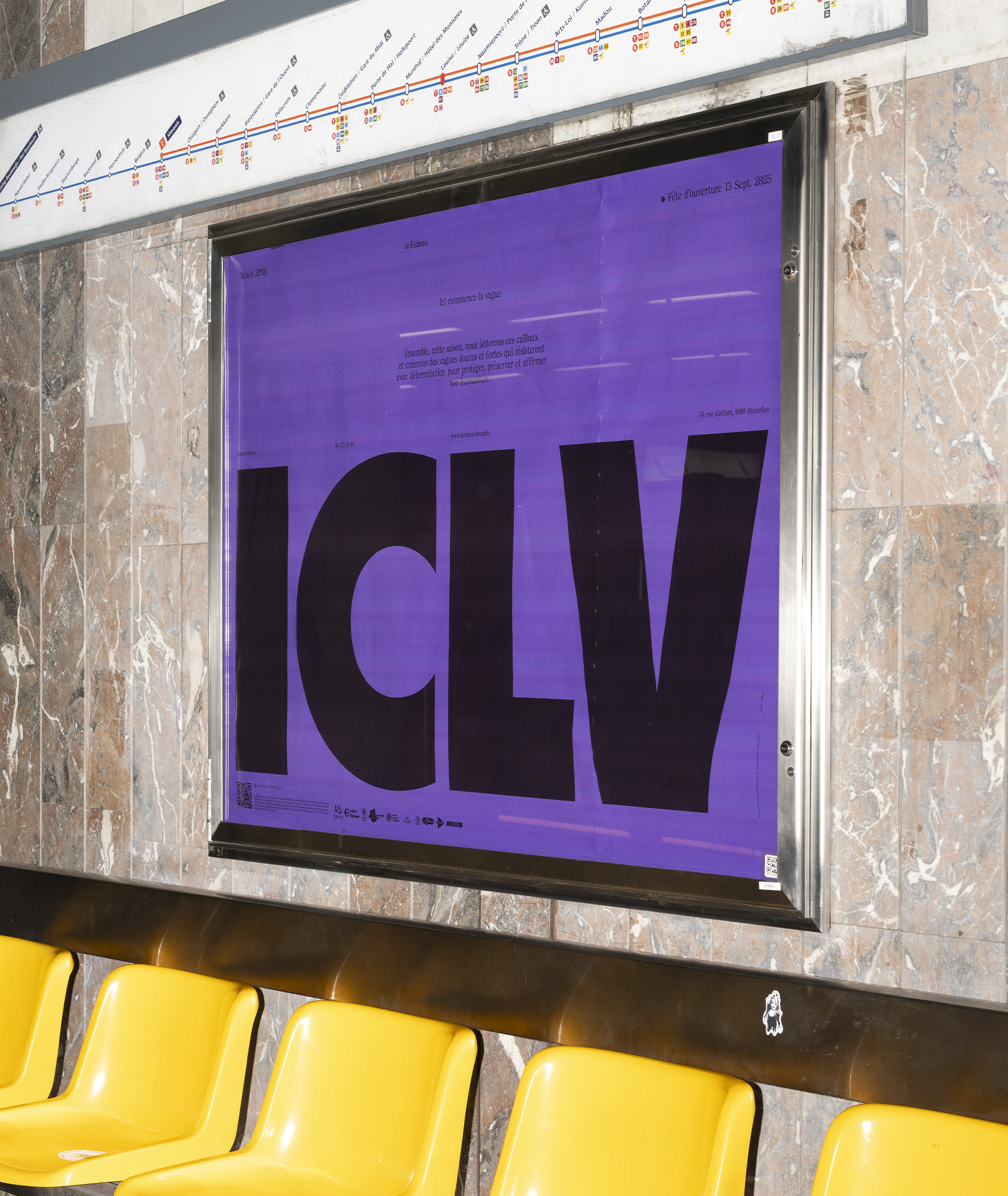
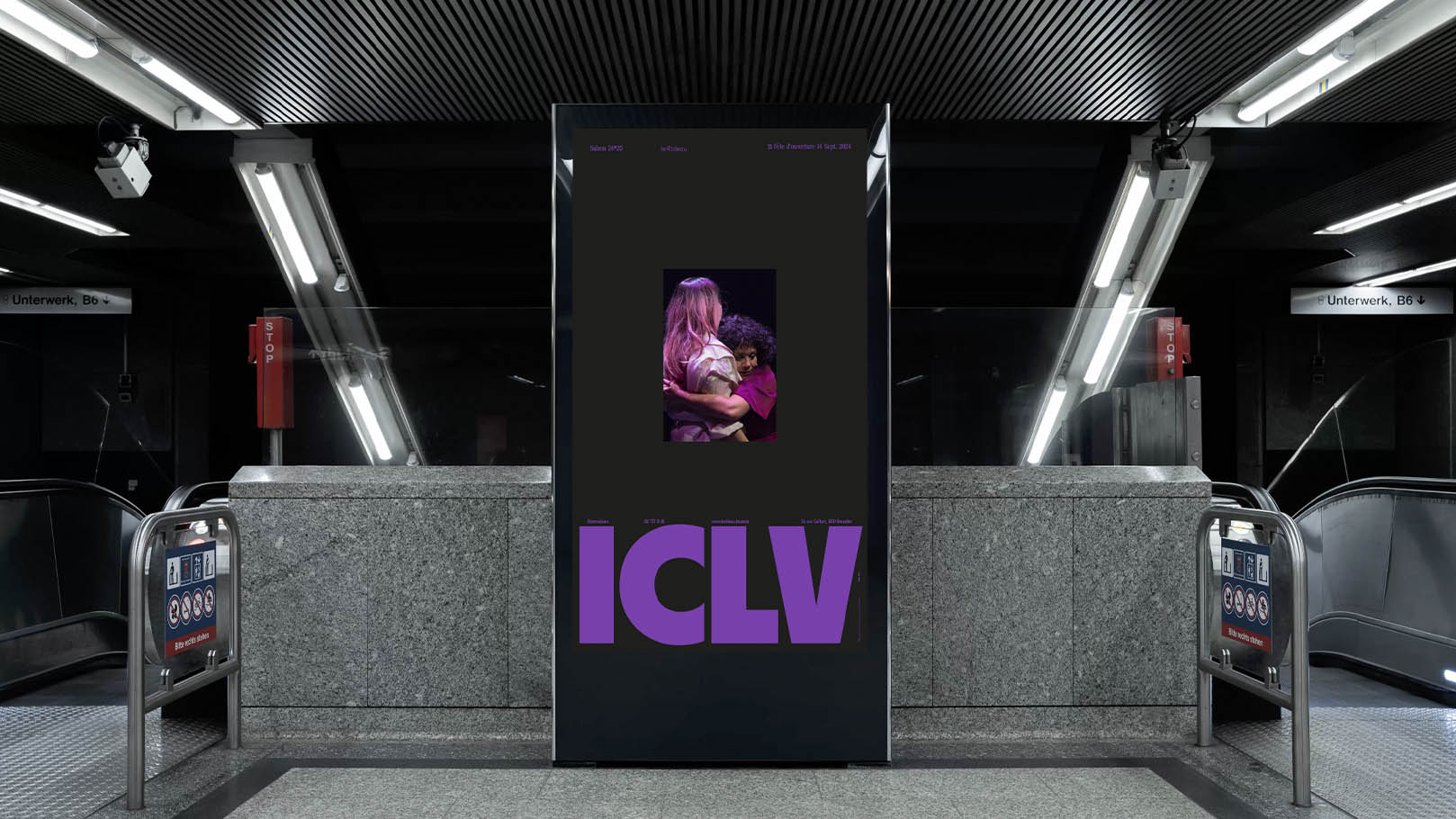
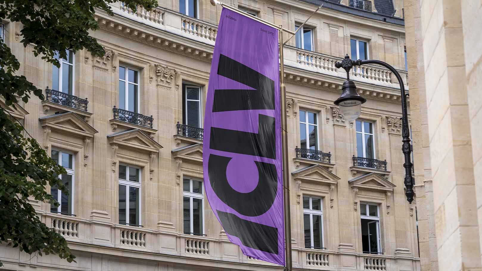
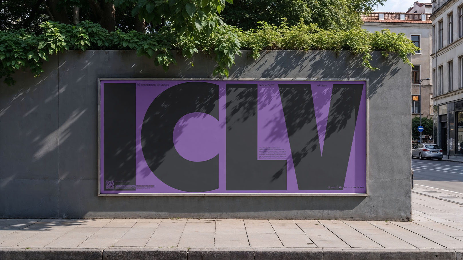
+ Built for the public, not the studio
This campaign lives in the wild. We designed for street speed and screen speed: legible in two seconds at a bus shelter, compelling in a three-second scroll, coherent across a city. Modular headlines, concise copy, and consistent rhythm ensure recognition from the metro platform to the homepage..
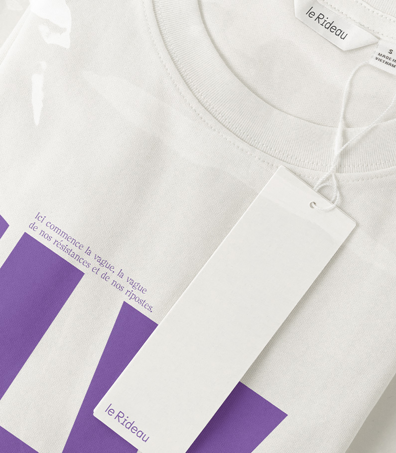
+ From spark to citywide presence
We handled the campaign end-to-end: strategic framing, visual system, messaging, production, media adaptations, and rollout. One direction, many surfaces — posters, OOH, digital placements, social, press kits — all carrying the same purple current..
+ A wave, not a whisper
ICLV doesn’t decorate the season; it mobilizes it. Strong design with real stakes, aimed at the broadest audience — a public campaign that looks sharp and stands for something.
Le Rideau *25.26
Arts & Culture
From brief to billboards
Next Project
Mosaert, Entertainement
Mosaert, Entertainement
+ Purple with a purpose
For Le Rideau’s new season, we chose a single, unflinching signal: suffragette purple. Not a mood, a message. The color threads the entire campaign — print, digital, motion — as a tribute to those who fought for a voice, and an invitation to use it now.
.
+ Design that hits hard — and means something
We set out to combine strong form with clear intent. Bold layouts grab attention; the narrative beneath gives it weight. Form gets you to stop; meaning makes you stay. Every asset balances urgency and dignity, avoiding nostalgia while honoring the movement’s legacy.
.
+ Built for the public, not the studio
This campaign lives in the wild. We designed for street speed and screen speed: legible in two seconds at a bus shelter, compelling in a three-second scroll, coherent across a city. Modular headlines, concise copy, and consistent rhythm ensure recognition from the metro platform to the homepage.
.
+ From spark to citywide presence
We handled the campaign end-to-end: strategic framing, visual system, messaging, production, media adaptations, and rollout. One direction, many surfaces — posters, OOH, digital placements, social, press kits — all carrying the same purple current.
.
+ A wave, not a whisper
ICLV doesn’t decorate the season; it mobilizes it. Strong design with real stakes, aimed at the broadest audience — a public campaign that looks sharp and stands for something.