a Brussels icon of multi-brand lifestyle,
rebuilt for its next decade.
-
+ From local favorite to independent platform
Ten years in, Blender wasn’t asking to look older — it was ready to look clearer. We delivered a full rebrand (identity + digital) with one goal: turn style into autonomy. A toolkit the team can run A→Z without hand-holding..
+ Strategy: own your voice, own your ops
Not just “new visuals.” We built an operating system: a brand that speaks confidently, merchandises partners intelligently, and publishes fast — window, website, social — all managed in-house..
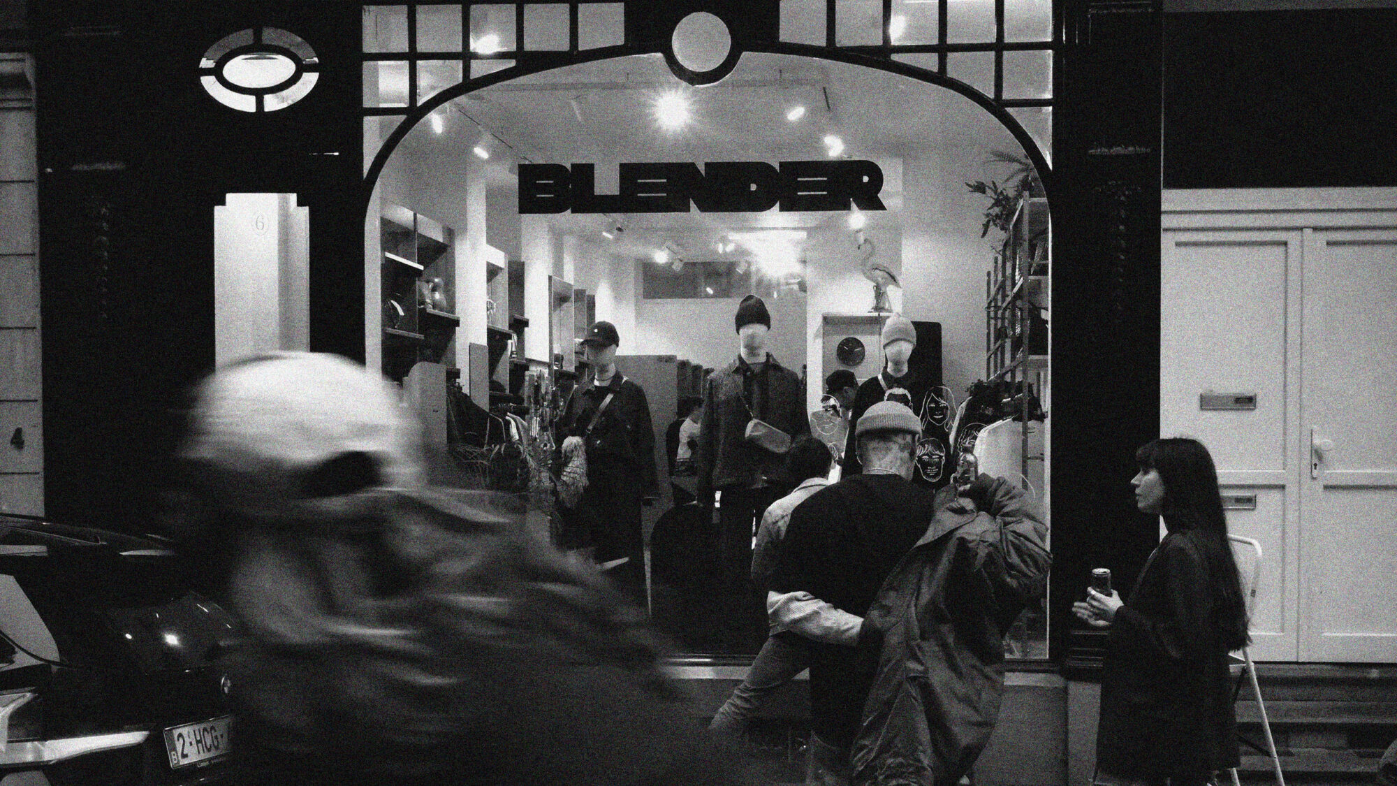
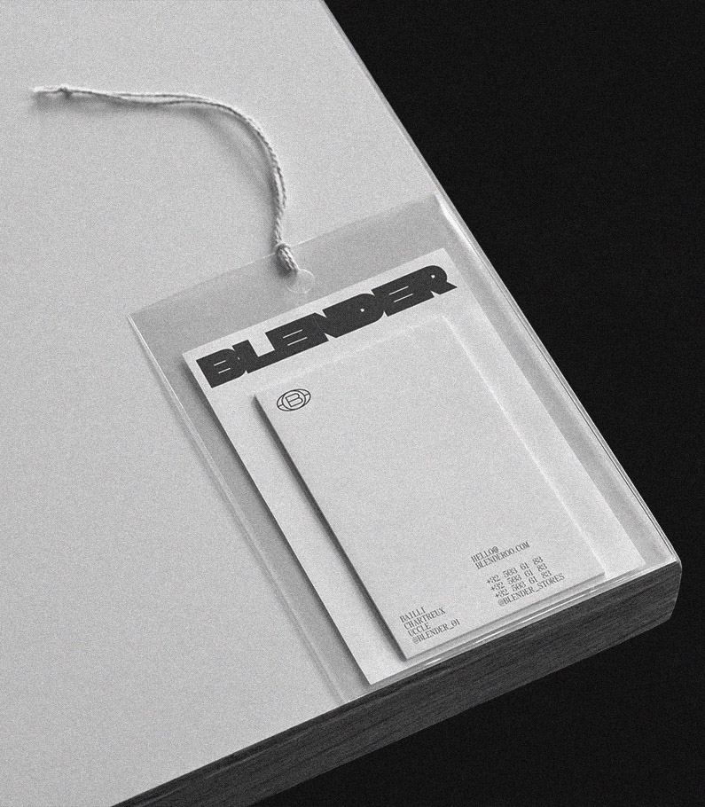
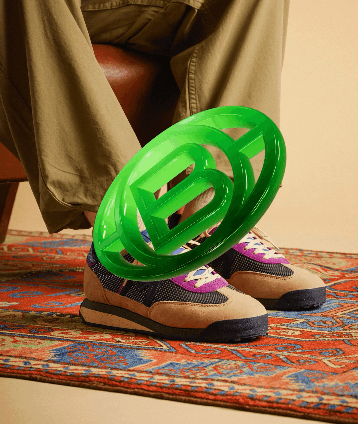
+ Identity: individuality over blanding
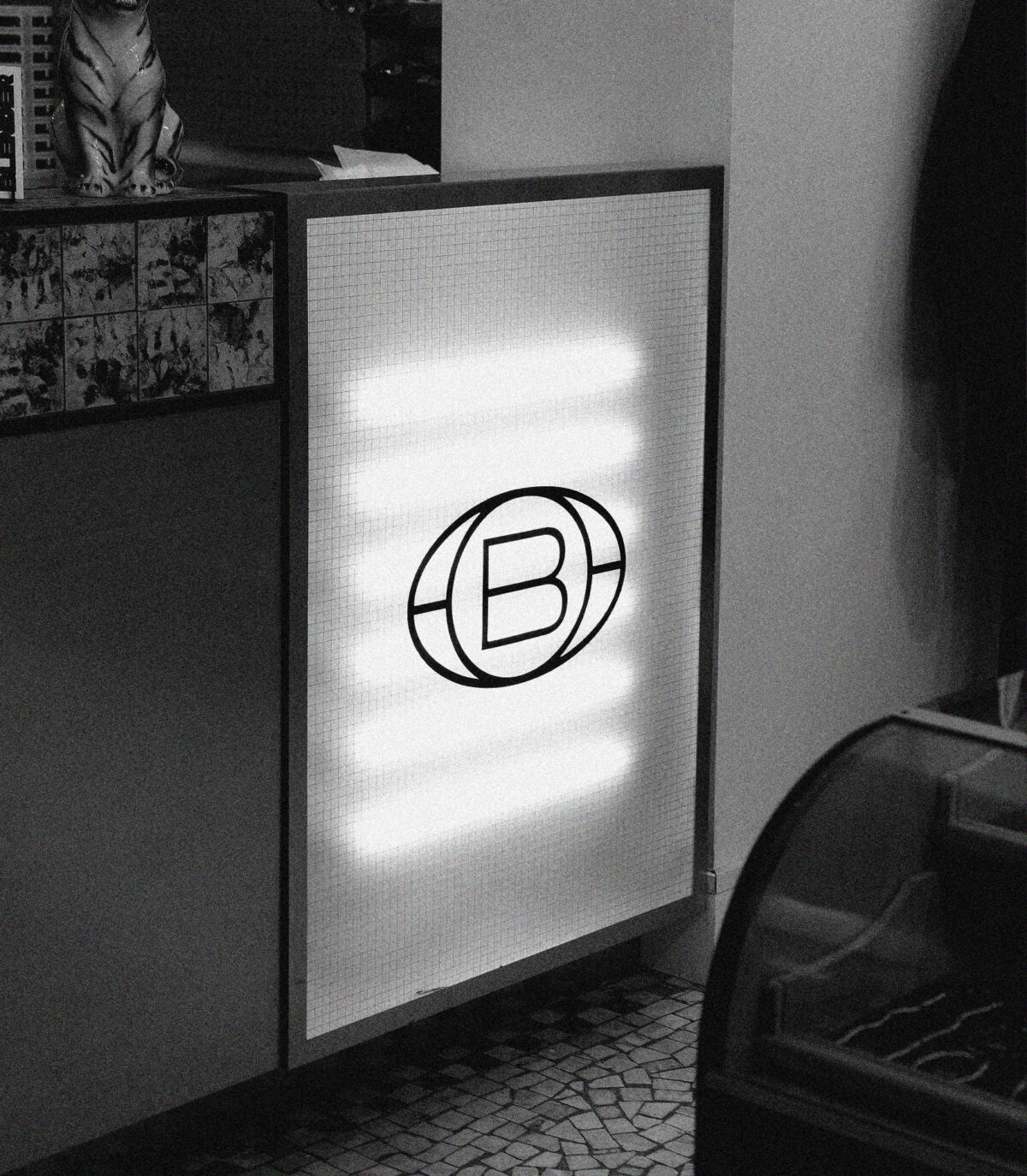
We rejected retail’s sanded-down sameness. Blender’s identity is a stance — recognisable, opinionated, human. The logo isn’t decoration; it’s a statement of individuality. Around it: assertive headlines, disciplined grids, and a curated tone. Distinct by design, never loud for loud’s sake..
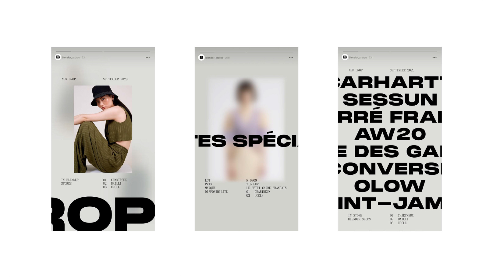
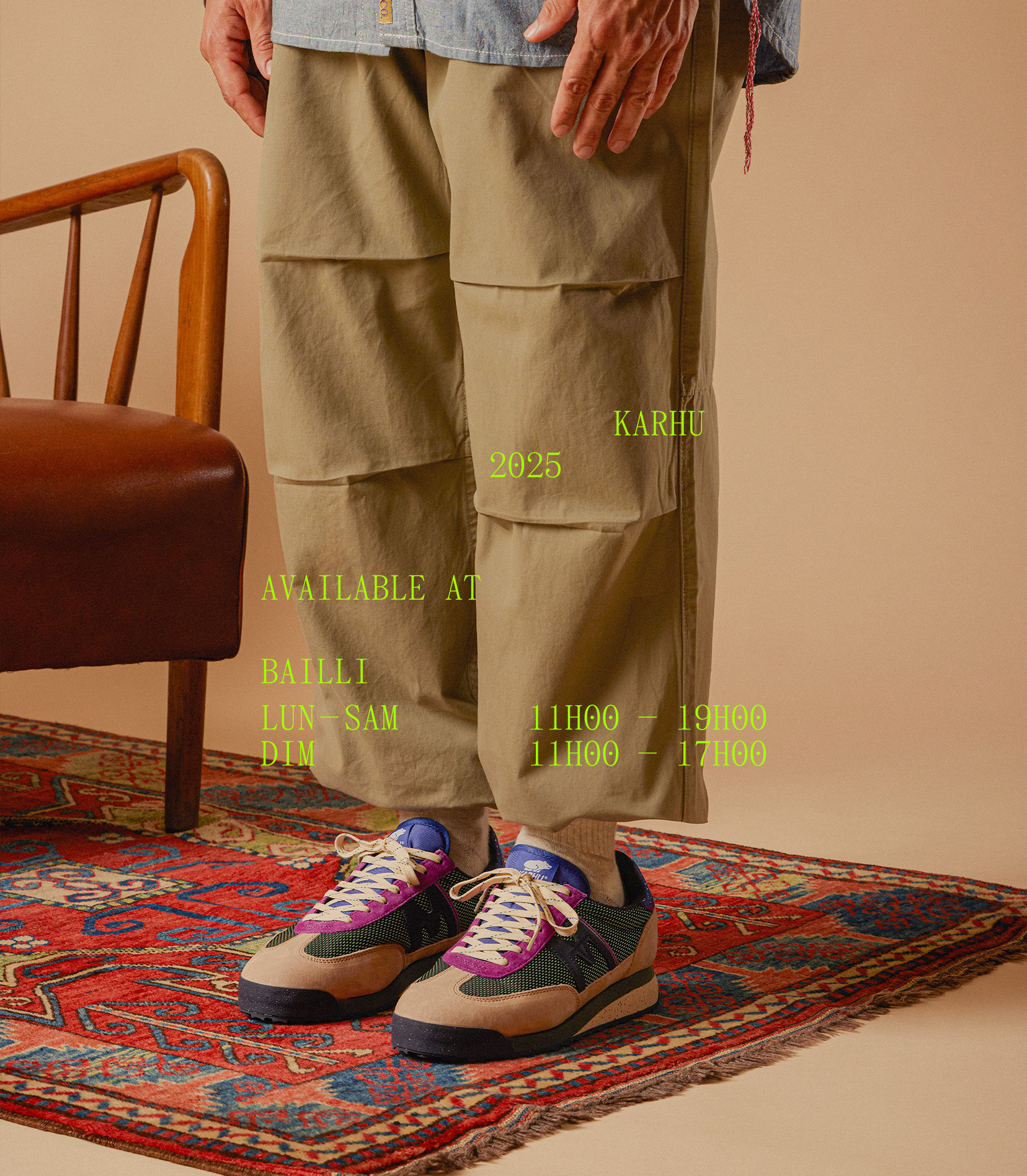
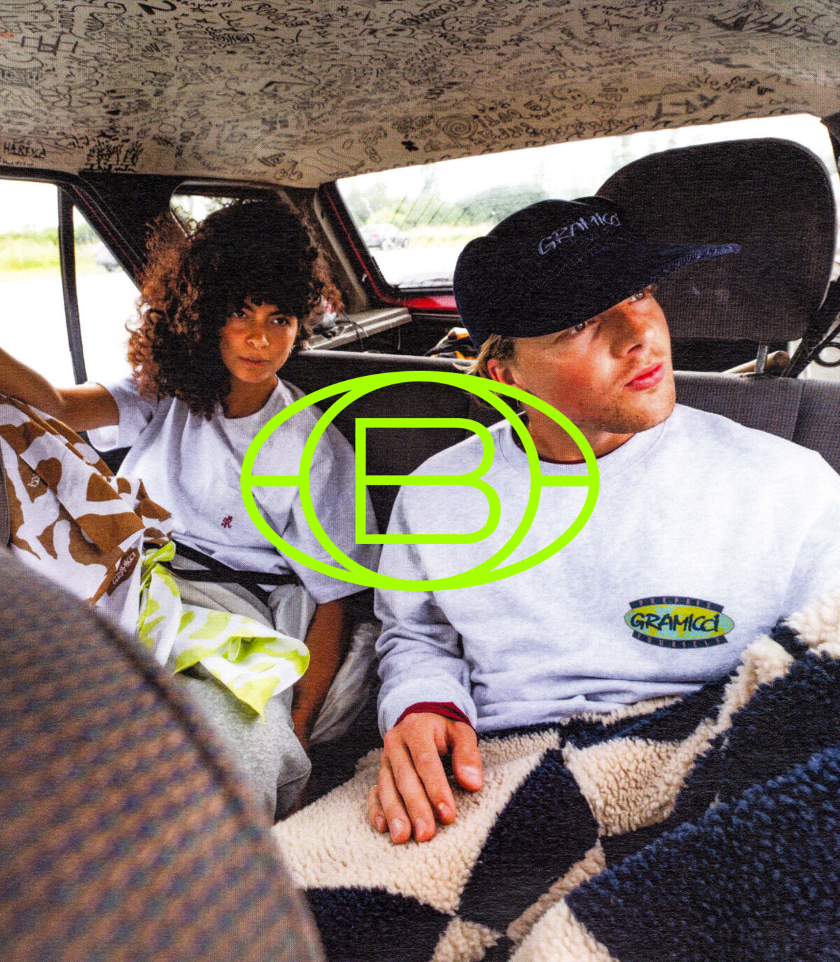
+ Mix-ready, never washed-out
As a multi-brand store, Blender must sit beside global campaign visuals. We built a co-branding system that keeps hierarchy and spacing clear, so partner assets shine — and Blender stays unmistakable..
+ Digital: simple, efficient, owner-operated
The site is engineered for autonomy. Clean IA, modular templates, and straightforward blocks let the team update drops, brand spotlights, and seasonal edits in minutes. Brand-forward, partner-friendly: easy to feature labels, refresh home/category, and keep rhythm without breaking the look..
+ Voice & governance: the rulebook, not handcuffs
We delivered a brand kit — logo use, type ramp, image ratios, tone, co-branding do/don’t — plus editable templates for newsletters, social, OOH. Clear rules, light touch, maximum speed..
+ Outcome: independent and unmistakable
A rebrand with meaning, a digital platform that runs smoothly, and the keys to drive it alone. Strong enough to stand out; flexible enough to play with the world’s brands — and always recognisably Blender.
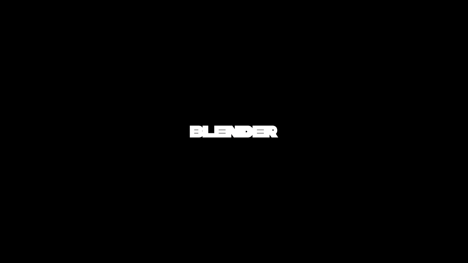
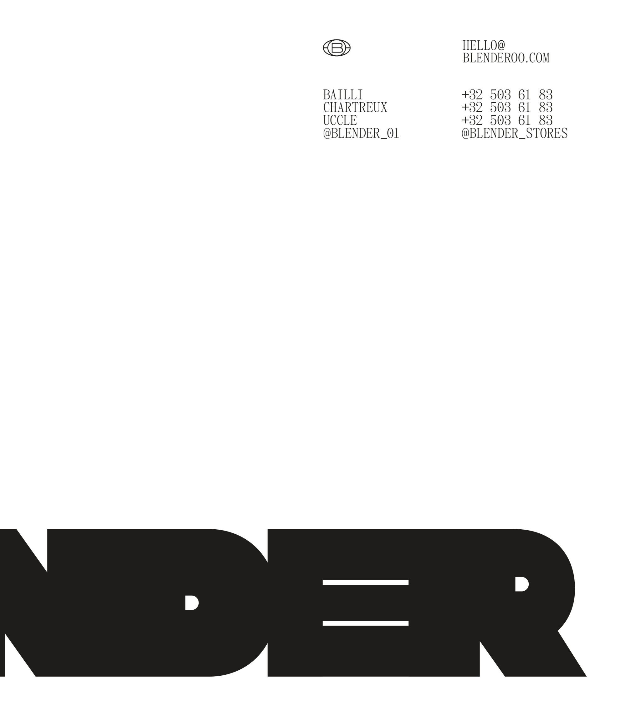
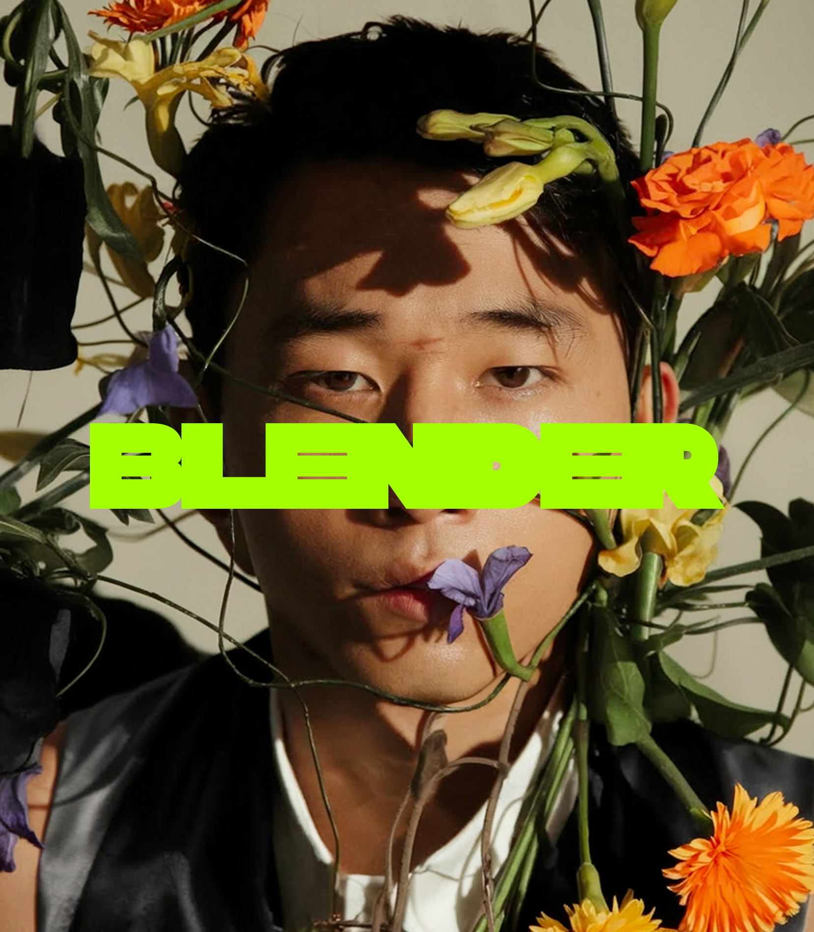
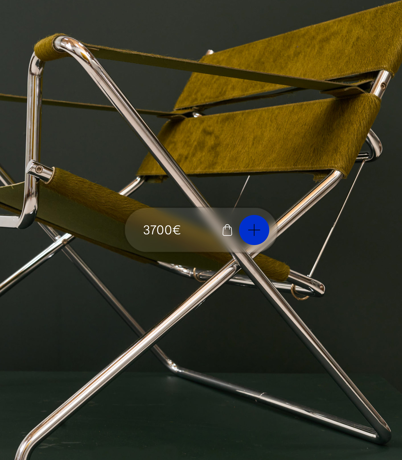
Blender
Retail
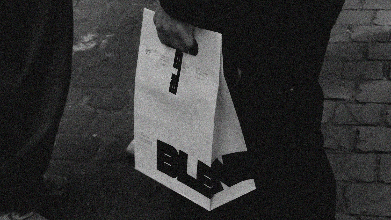
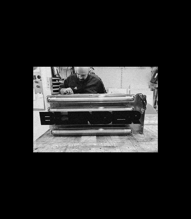
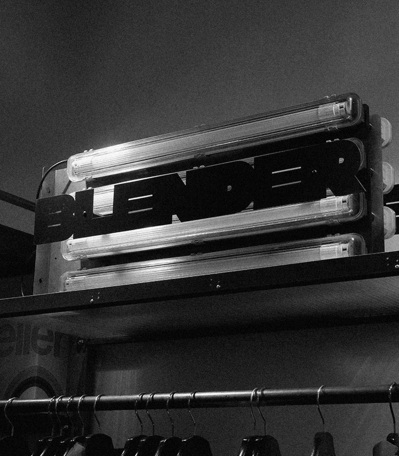
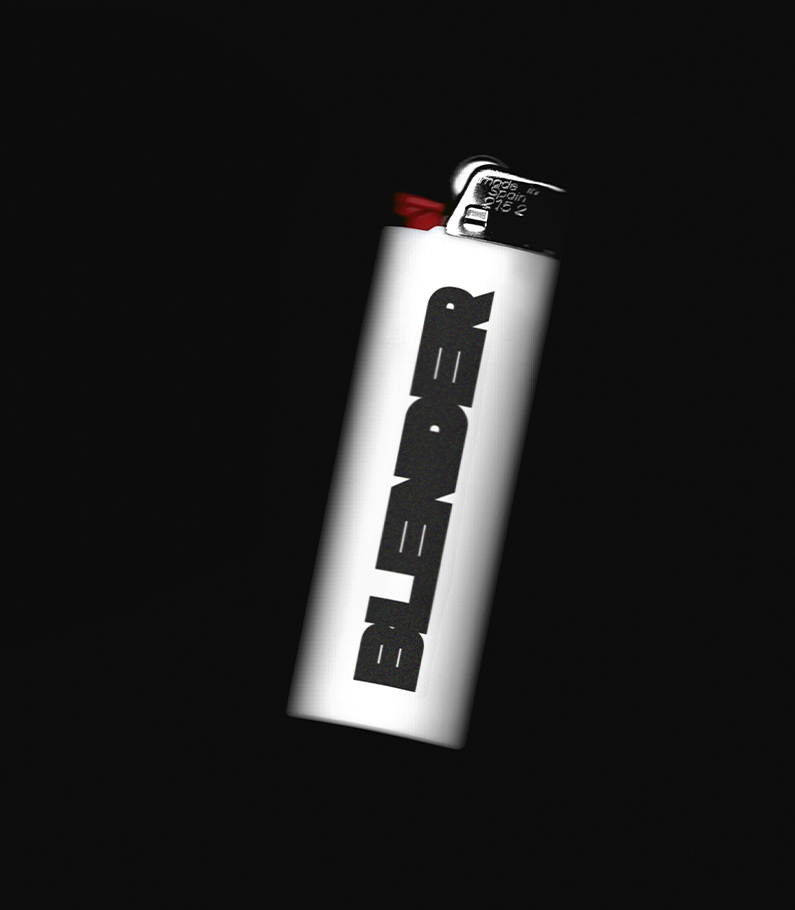
not a logo,
a statement of individuality.
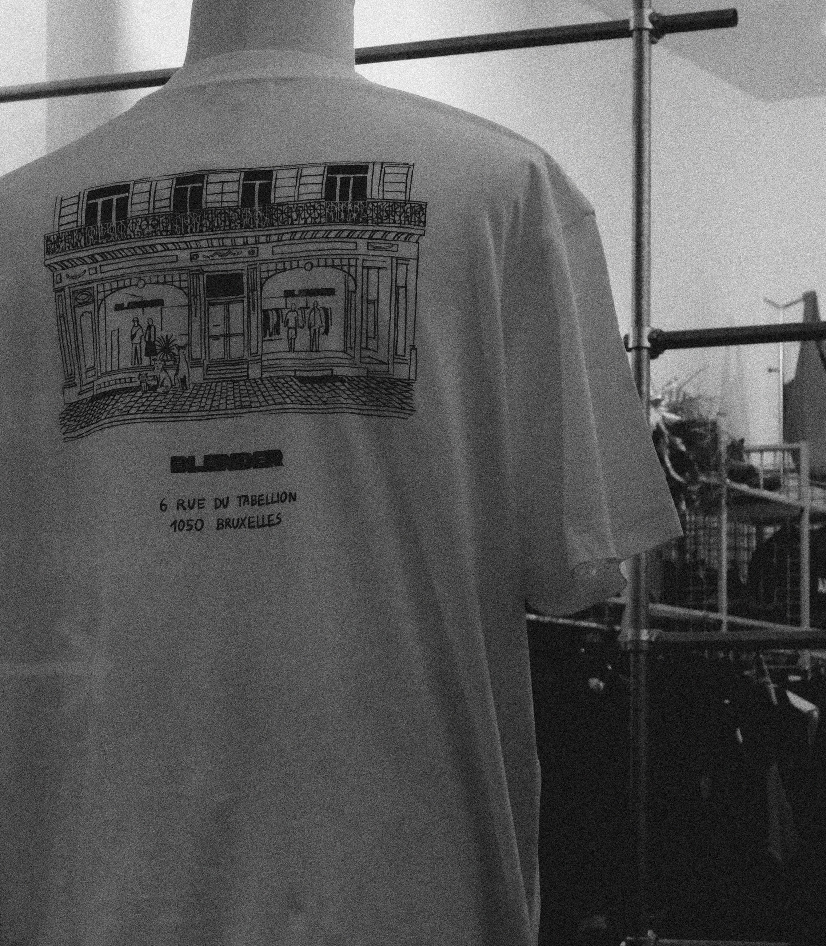
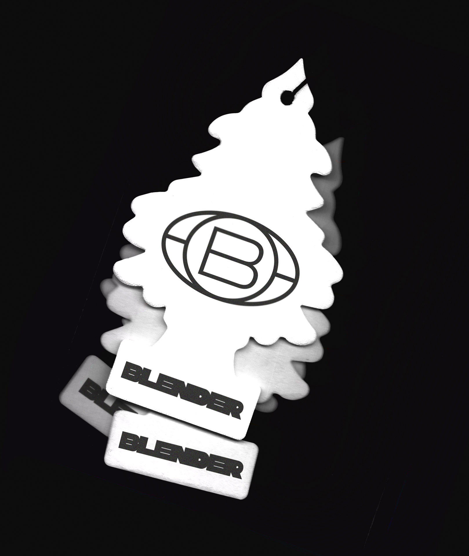
Built to coexist: pairs with partner visuals
and stays unmistakably Blender.
Next Project
Leonet Hoang, Design & Architecture
Leonet Hoang, Design & Architecture
+ From local favorite to independent platform
Ten years in, Blender wasn’t asking to look older — it was ready to look clearer. We delivered a full rebrand (identity + digital) with one goal: turn style into autonomy. A toolkit the team can run A→Z without hand-holding.
.
+ Strategy: own your voice, own your ops
Not just “new visuals.” We built an operating system: a brand that speaks confidently, merchandises partners intelligently, and publishes fast — window, website, social — all managed in-house.
.
+ Identity: individuality over blanding
We rejected retail’s sanded-down sameness. Blender’s identity is a stance — recognisable, opinionated, human. The logo isn’t decoration; it’s a statement of individuality. Around it: assertive headlines, disciplined grids, and a curated tone. Distinct by design, never loud for loud’s sake.
.
+ Mix-ready, never washed-out
As a multi-brand store, Blender must sit beside global campaign visuals. We built a co-branding system that keeps hierarchy and spacing clear, so partner assets shine — and Blender stays unmistakable.
.
+ Digital: simple, efficient, owner-operated
The site is engineered for autonomy. Clean IA, modular templates, and straightforward blocks let the team update drops, brand spotlights, and seasonal edits in minutes. Brand-forward, partner-friendly: easy to feature labels, refresh home/category, and keep rhythm without breaking the look.
.
+ Voice & governance: the rulebook, not handcuffs
We delivered a brand kit — logo use, type ramp, image ratios, tone, co-branding do/don’t — plus editable templates for newsletters, social, OOH. Clear rules, light touch, maximum speed.
.
+ Outcome: independent and unmistakable
A rebrand with meaning, a digital platform that runs smoothly, and the keys to drive it alone. Strong enough to stand out; flexible enough to play with the world’s brands — and always recognisably Blender.