125 years of heritage,
distilled into a timeless identity.
-
+ Honoring the Past, Shaping the Future
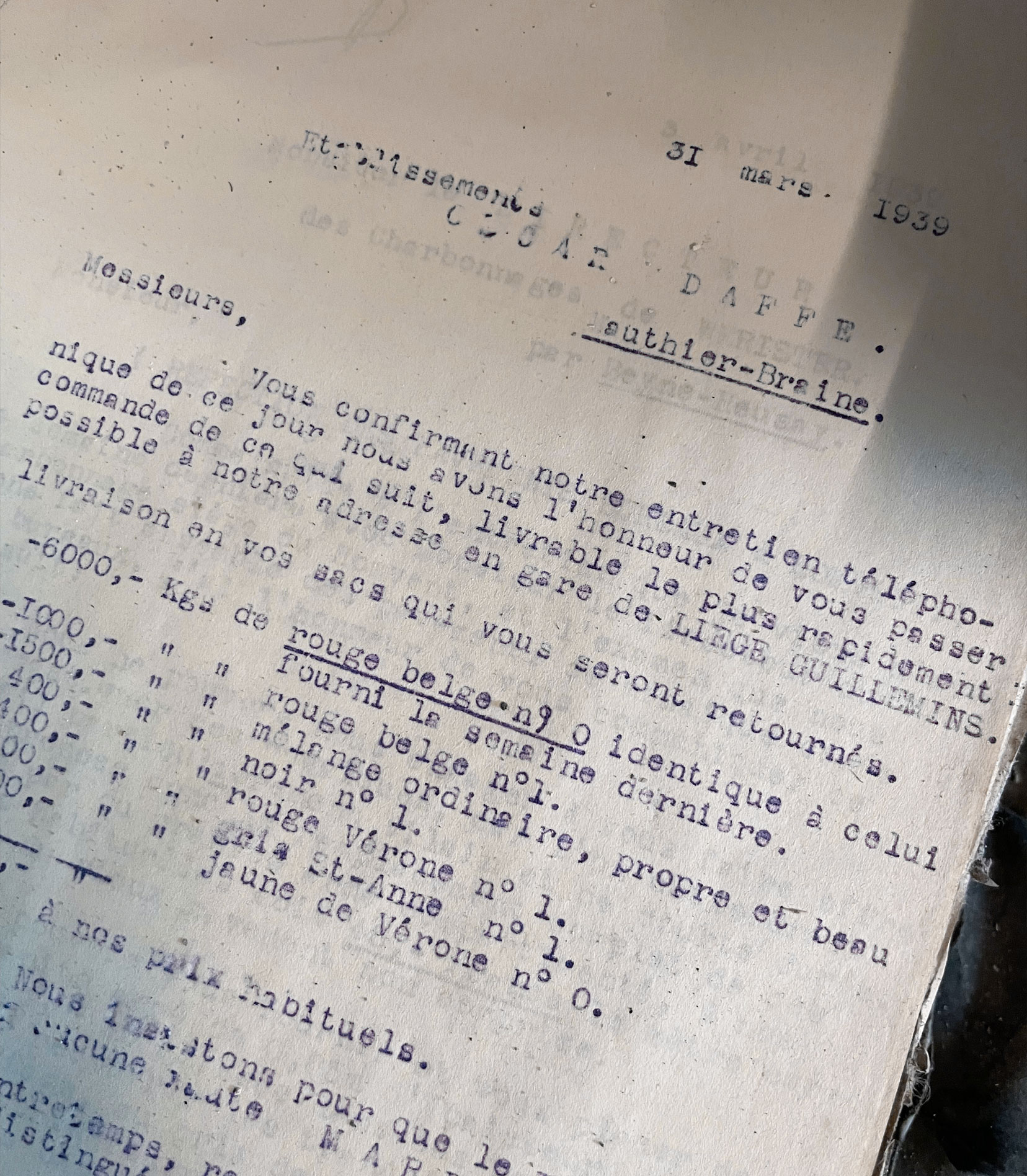
Rebranding a house like Bernardin isn’t about starting from scratch — it’s about amplifying what’s already there. After the company’s acquisition by the Dumont brothers, the challenge was clear: how to refresh a Belgian terrazzo pioneer with 125 years of history without losing the essence that made it unique..
+ Strategy: From Craft to Market Leadership
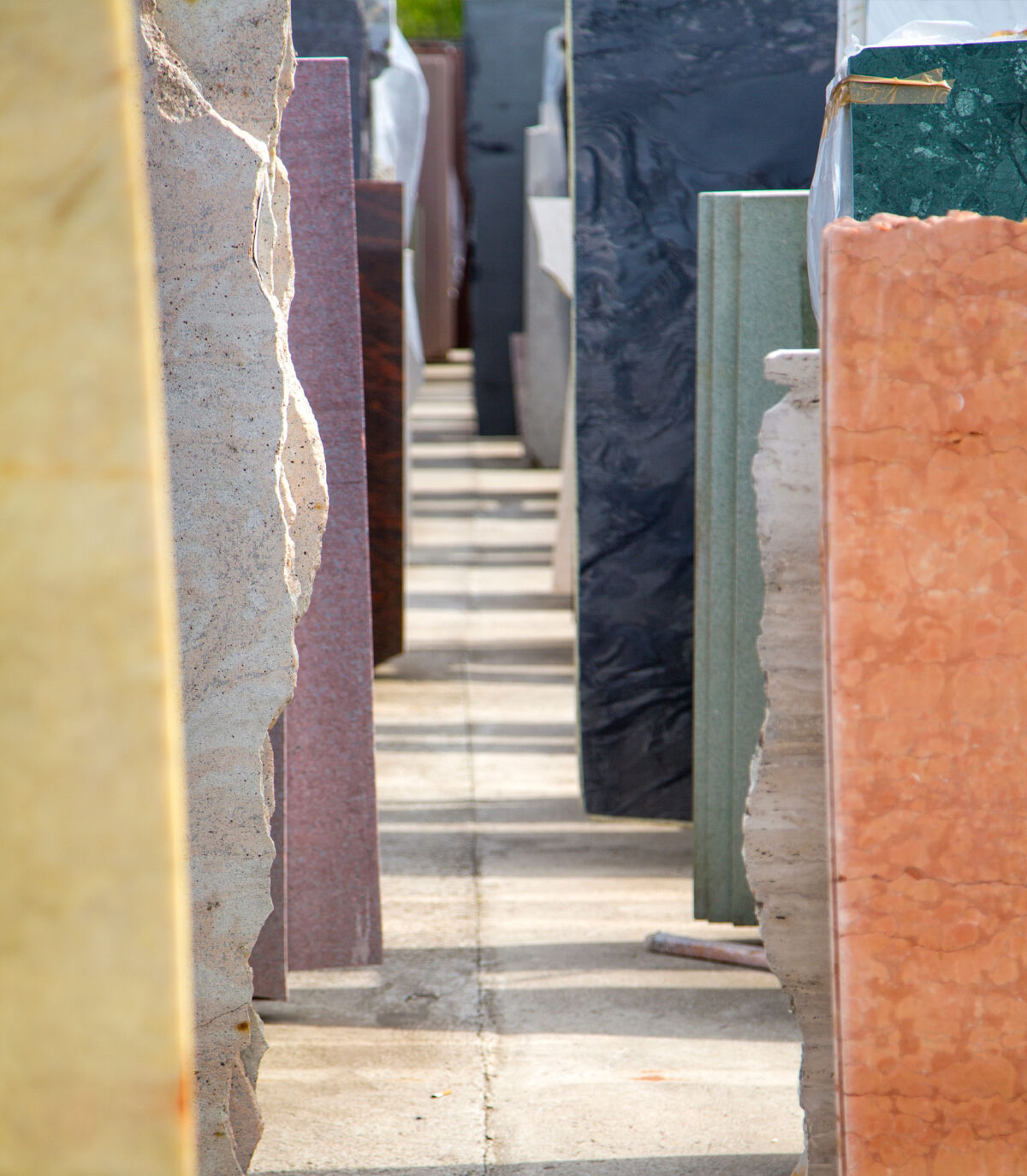
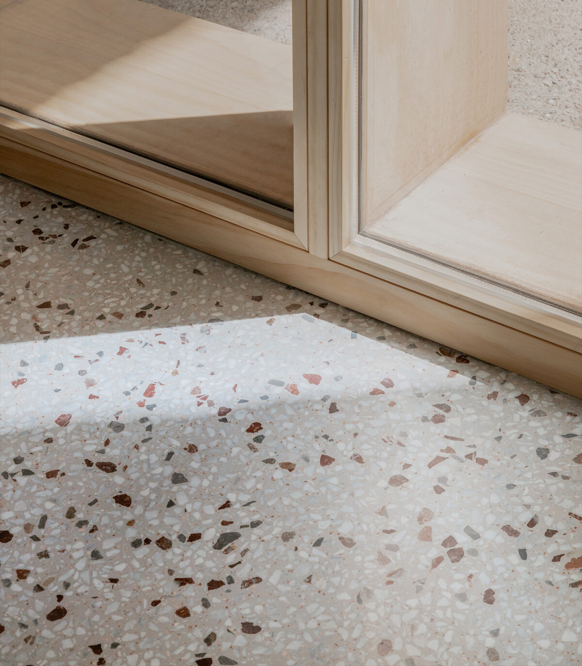
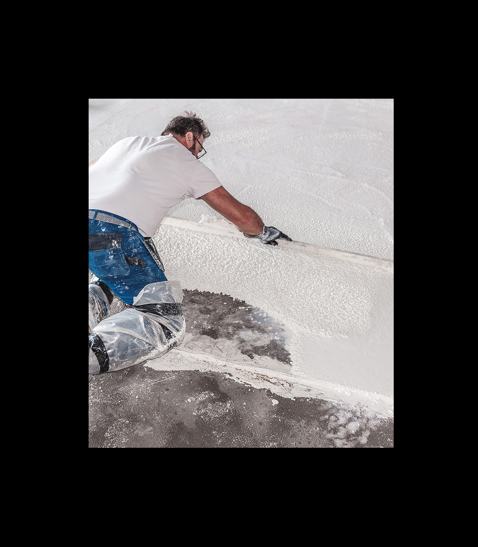
Our brand strategy was simple yet ambitious: position Bernardin as the European reference in terrazzo. The goal was to place know-how at the center of communication, making expertise the brand’s loudest and most recognizable voice. Terrazzo is more than material — it’s an art form shaped by patience, precision, and permanence. Bernardin had to become not only a supplier, but the undeniable benchmark..
+ A Creative Compass: John Lautner
For inspiration, we turned to the work of John Lautner, the American architect behind “Desert Modernism.” Lautner fused bold geometric forms with untamed nature, creating futuristic houses that were both organic and timeless. His ability to bridge architecture and landscape offered us a guiding principle: design an identity for Bernardin that is strong, modern, and yet seamlessly anchored in nature and craft..
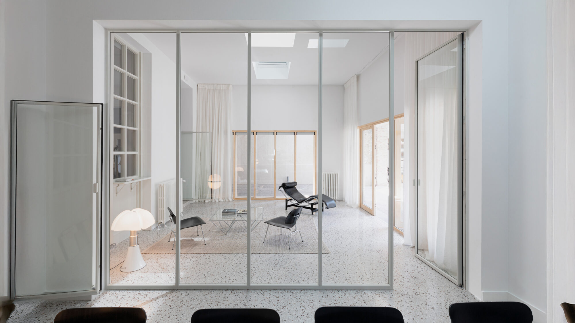
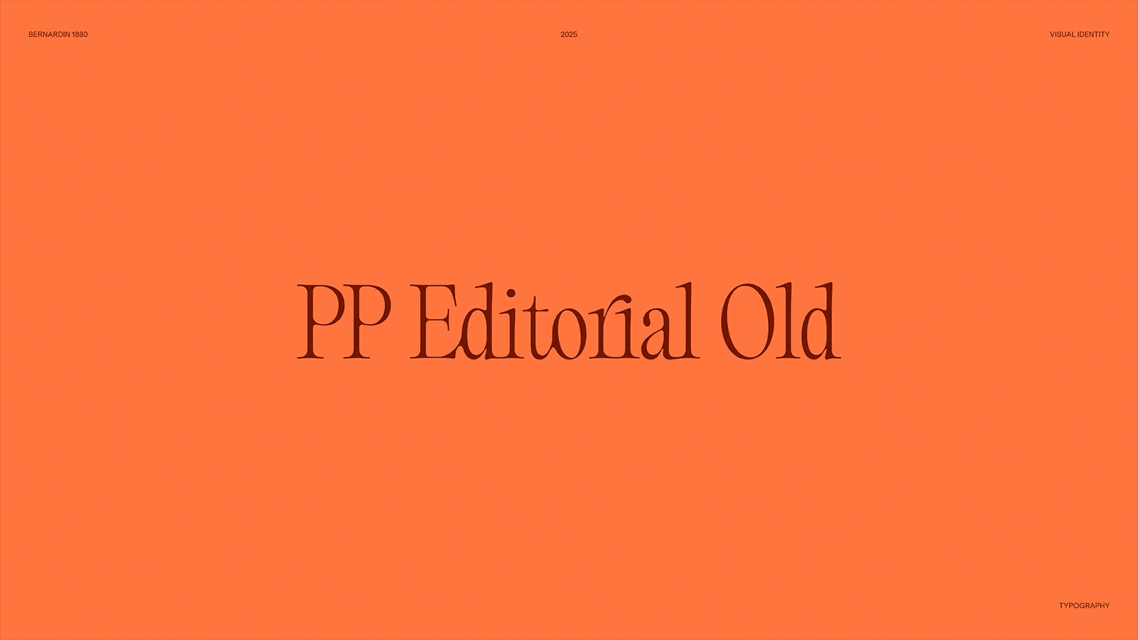
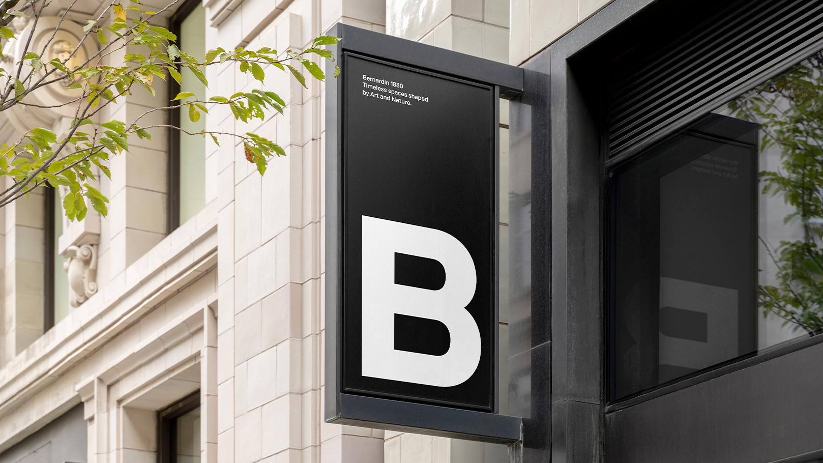
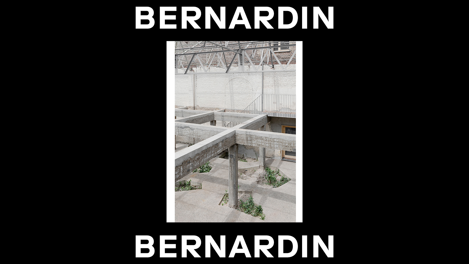
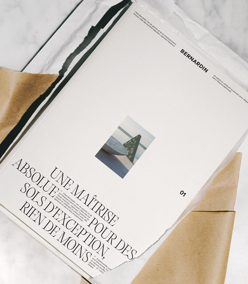
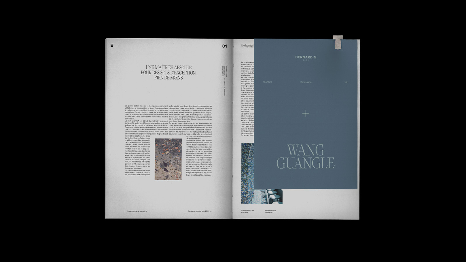
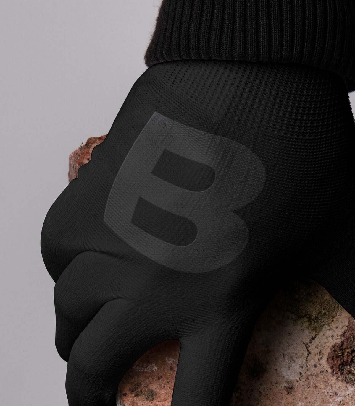
+ Visual Identity: Timeless, Not Trend-Driven
The new visual identity reflects these values. Built around a bold typographic universe and a graphic system designed for endurance, it avoids fleeting trends in favor of timeless clarity. Every detail was crafted to withstand time — much like the terrazzo surfaces Bernardin has been perfecting since 1880. This is an identity meant to live not just for today, but for the next 100 years..
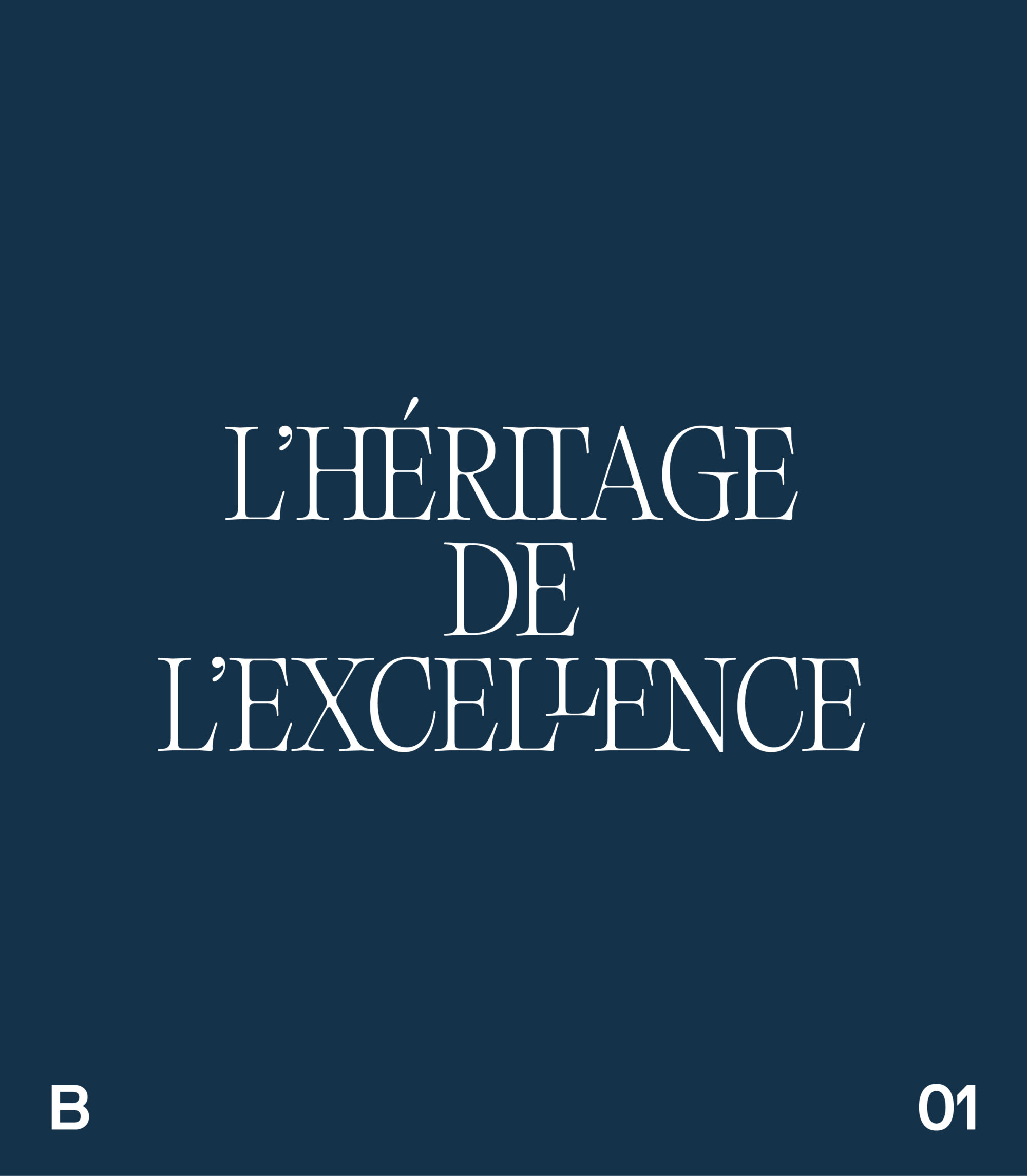
+ Verbal Identity: Shaped by Art and Nature
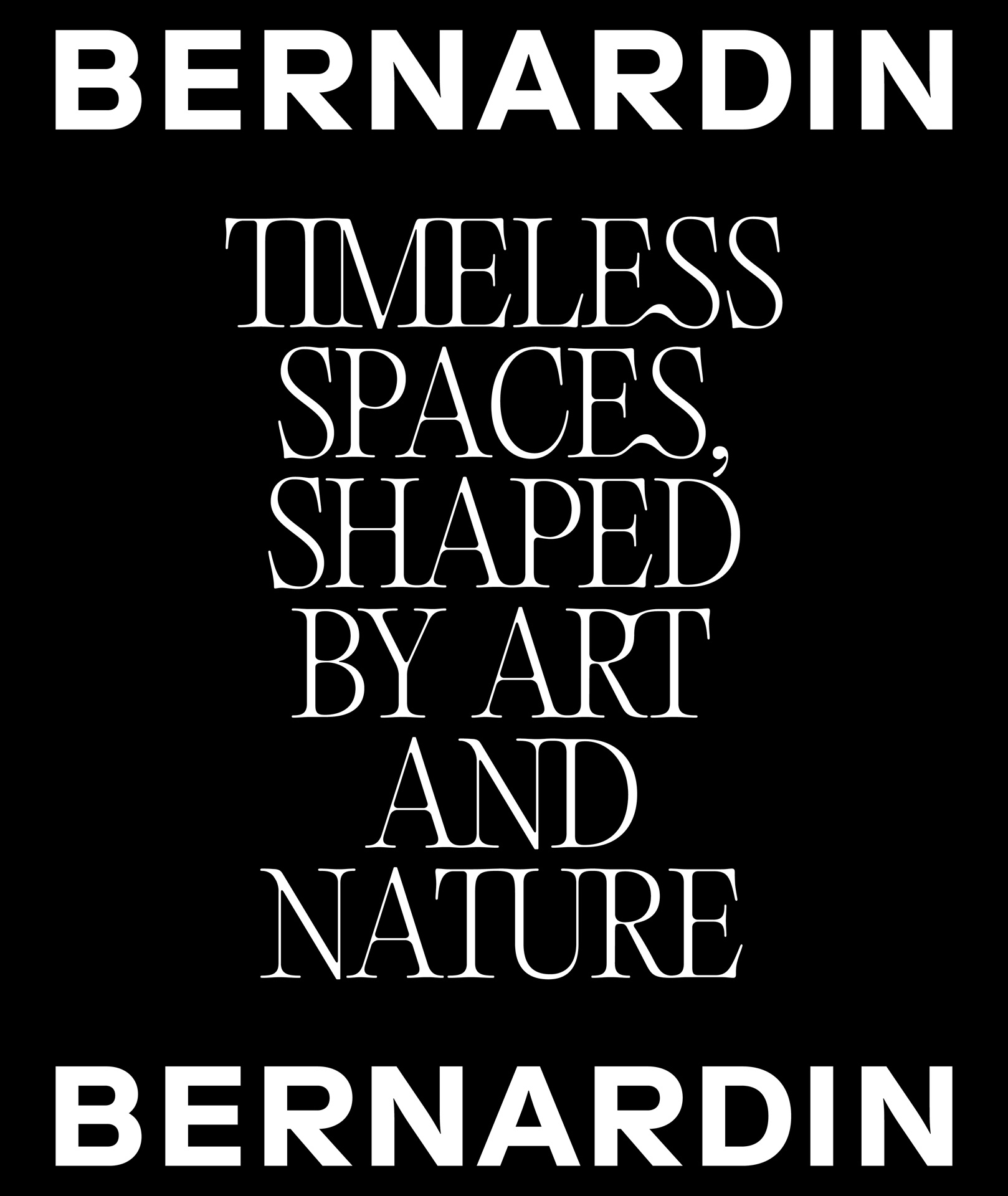
Words matter as much as visuals. We developed a strong verbal identity, anchored by the baseline: “Timeless spaces shaped by art and nature.” The tone is bold yet welcoming, able to inspire while staying close to people. It speaks of heritage and future, of material and imagination, balancing the poetry of craft with the precision of architecture..
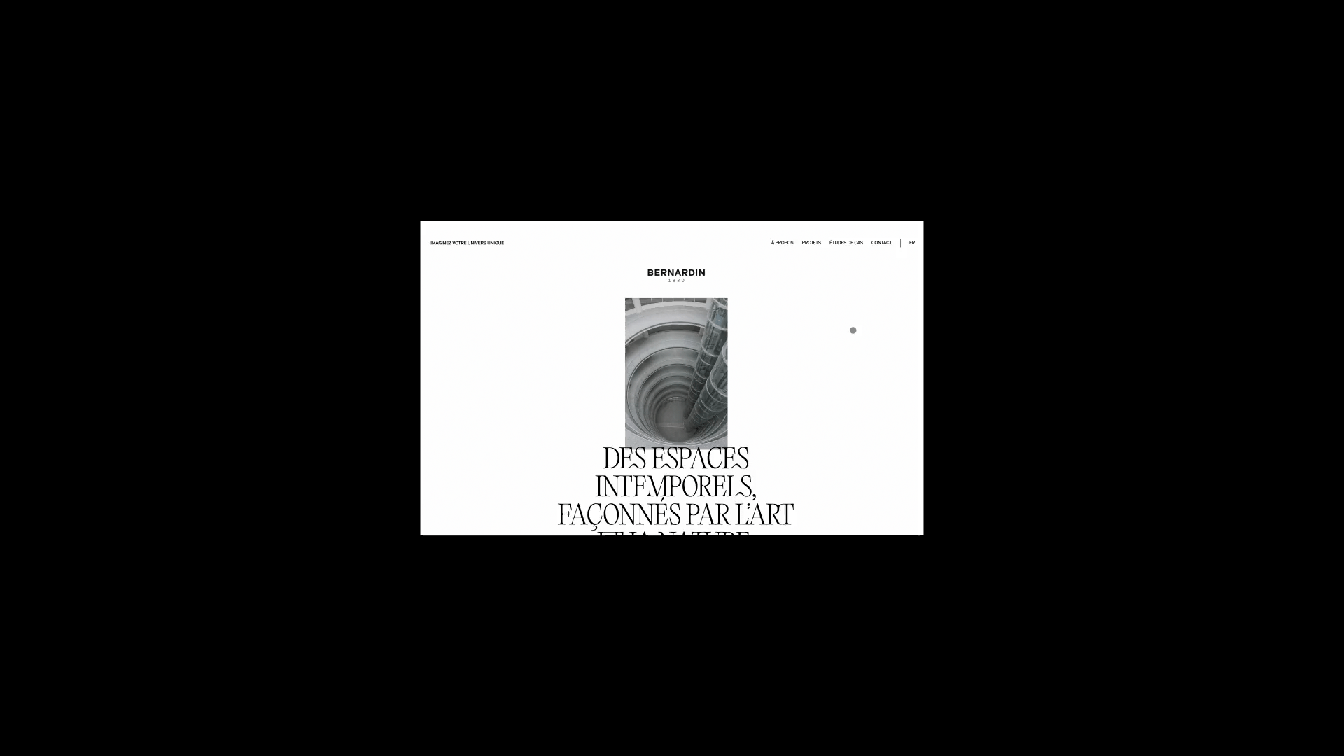
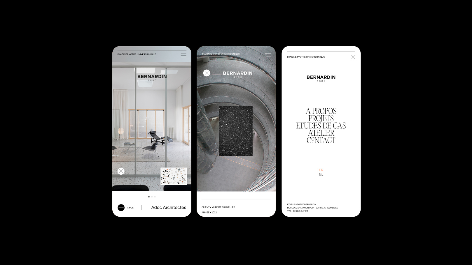
+ Digital Presence: A Classic Stage for Expertise
The digital rollout combined a showcase website and a coherent social media strategy. The site was designed with classic ergonomics in mind: simple, intuitive, and elegant, allowing the projects and expertise to take center stage. On social media, Bernardin’s presence was structured to highlight craftsmanship, knowledge, and execution — transforming know-how into compelling stories..
+ Built to Last
Rebranding Bernardin 1880 was never about reinvention. It was about continuity, elevation, and endurance. Today, the brand carries a new identity that honors its 19th-century origins while positioning it for a global future. Bold, timeless, and built to last — hopefully for the next hundred years.
Bernardin 1880
Design & Architecture
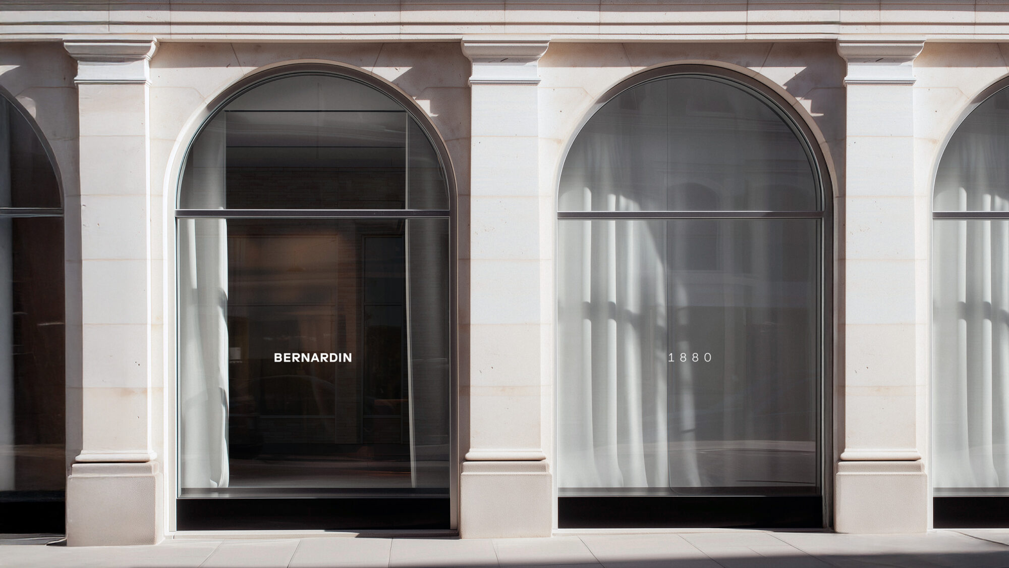
Not a trend, but a foundation
A brand system built hopefully for
the next hundred years
Next Project
FERN Studio, Entertainement
FERN Studio, Entertainement
+ Honoring the Past, Shaping the Future
Rebranding a house like Bernardin isn’t about starting from scratch — it’s about amplifying what’s already there. After the company’s acquisition by the Dumont brothers, the challenge was clear: how to refresh a Belgian terrazzo pioneer with 125 years of history without losing the essence that made it unique.
.
+ Strategy: From Craft to Market Leadership
Our brand strategy was simple yet ambitious: position Bernardin as the European reference in terrazzo. The goal was to place know-how at the center of communication, making expertise the brand’s loudest and most recognizable voice. Terrazzo is more than material — it’s an art form shaped by patience, precision, and permanence. Bernardin had to become not only a supplier, but the undeniable benchmark.
.
+ A Creative Compass: John Lautner
For inspiration, we turned to the work of John Lautner, the American architect behind “Desert Modernism.” Lautner fused bold geometric forms with untamed nature, creating futuristic houses that were both organic and timeless. His ability to bridge architecture and landscape offered us a guiding principle: design an identity for Bernardin that is strong, modern, and yet seamlessly anchored in nature and craft.
.
+ Visual Identity: Timeless, Not Trend-Driven
The new visual identity reflects these values. Built around a bold typographic universe and a graphic system designed for endurance, it avoids fleeting trends in favor of timeless clarity. Every detail was crafted to withstand time — much like the terrazzo surfaces Bernardin has been perfecting since 1880. This is an identity meant to live not just for today, but for the next 100 years.
.
+ Verbal Identity: Shaped by Art and Nature
Words matter as much as visuals. We developed a strong verbal identity, anchored by the baseline: “Timeless spaces shaped by art and nature.” The tone is bold yet welcoming, able to inspire while staying close to people. It speaks of heritage and future, of material and imagination, balancing the poetry of craft with the precision of architecture.
.
+ Digital Presence: A Classic Stage for Expertise
The digital rollout combined a showcase website and a coherent social media strategy. The site was designed with classic ergonomics in mind: simple, intuitive, and elegant, allowing the projects and expertise to take center stage. On social media, Bernardin’s presence was structured to highlight craftsmanship, knowledge, and execution — transforming know-how into compelling stories.
.
+ Built to Last
Rebranding Bernardin 1880 was never about reinvention. It was about continuity, elevation, and endurance. Today, the brand carries a new identity that honors its 19th-century origins while positioning it for a global future. Bold, timeless, and built to last — hopefully for the next hundred years.