Amplifying the voice of Brussels’ prominent fashion and design platform MAD by fully overhauling their identity system.
-
Created in 2010 by the city of Brussels, MAD is a unique platform that supports the creative development of local designers and stylists.
MAD is an incubator at the forefront of innovation, celebrating fashion and design and promoting local creative talents. Their mission is twofold: while acting as a hub for designers and stylists, MAD is also a space for public activities, confronting a wider audience with on point work by contemporary creators via their exhibition and events programming.In April 2017 MAD opened the doors of its new multi-purpose building in the heart of Brussels’ buzzing Dansaert area. Our collaboration with the institution has been ongoing for the past thirteen years, as we’ve taken ownership of the entirety of their design and print work. It therefore was a logical step for us to rework MAD’s identity system following their move.
We worked closely with MAD’s core team to grasp their intentions and values, then set out to create a visual strategy that embraced them.
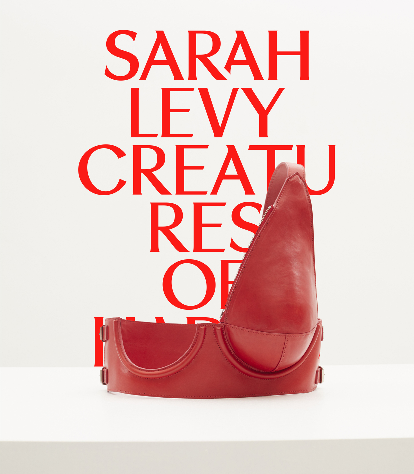
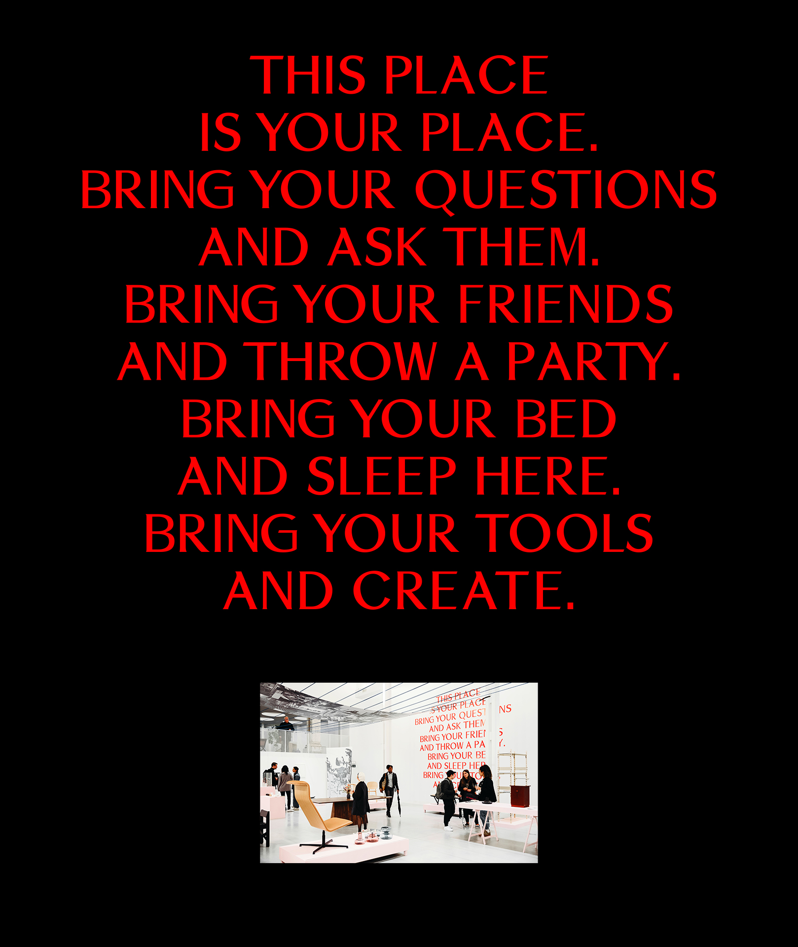
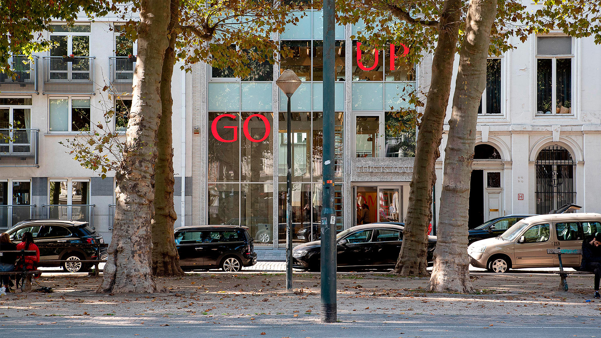
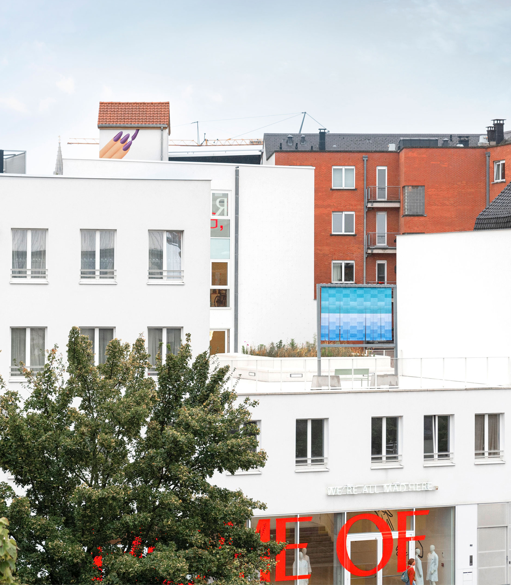
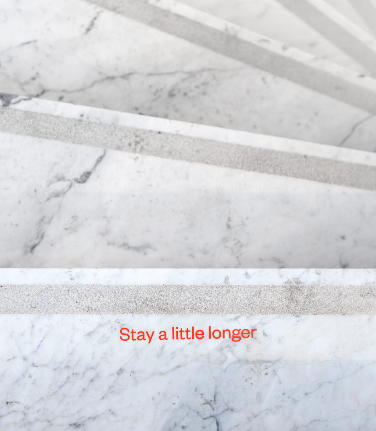
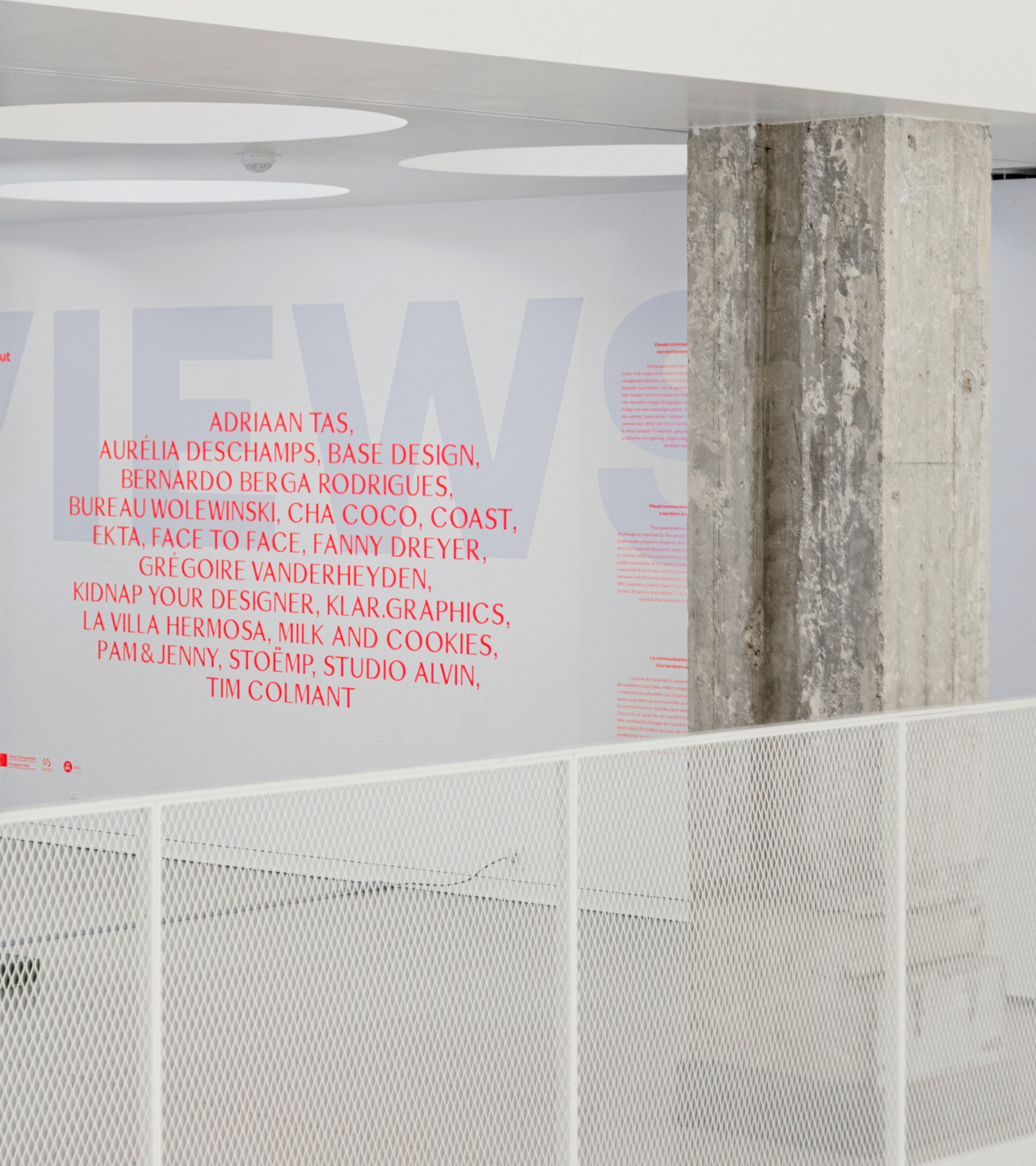
One of their key ambitions was to “turn the building into a home for all Brussels-based fashion and design professionals”. We unfolded this idea, commissioning copy from Club Paradis that personifies MAD as a welcoming character. Simple, direct phrases like “Create, we’ll do the rest” and “This place is your place” help to actively engage the audience, be they designers or general visitors. Emphasis was made on the people who make MAD the key creative hub of the city, giving a sense of ownership to the designers which in turn creates an intriguing, in-depth story for visitors. The phrases are also placed at strategic interior and exterior points in the building, opening up a conversation and reinforcing a feeling of familiarity.This tone of voice goes hand-in-hand with the visual identity designed and implemented across all communication tools, both print (flyers, signage) and digital (website, instagram, newsletters).
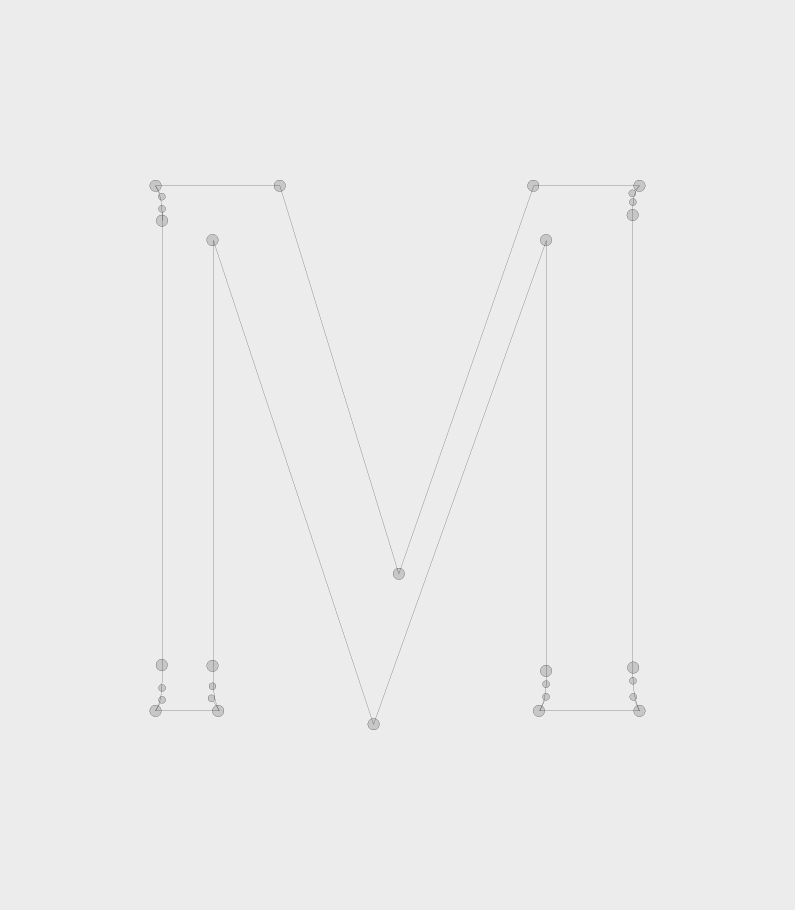
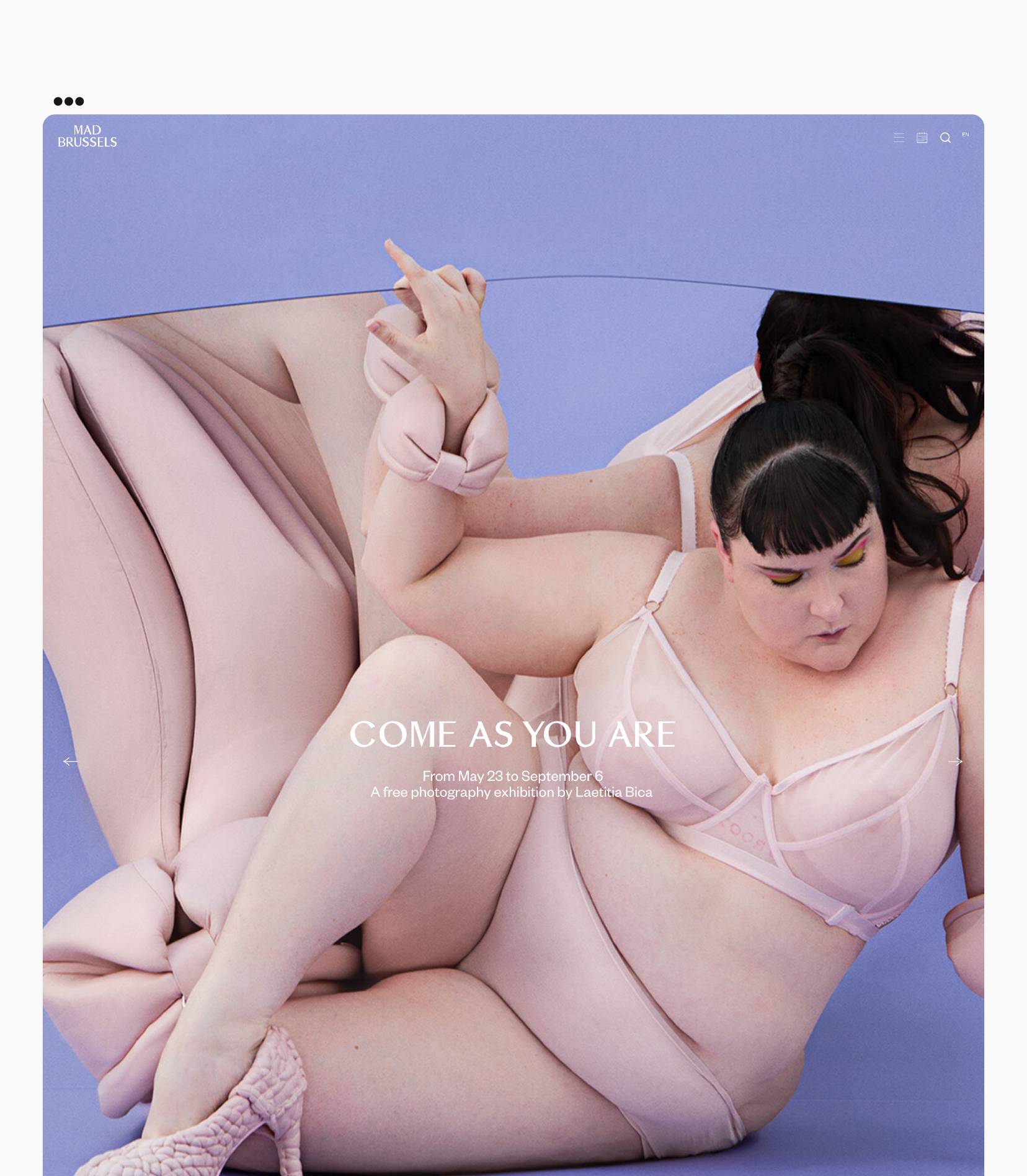
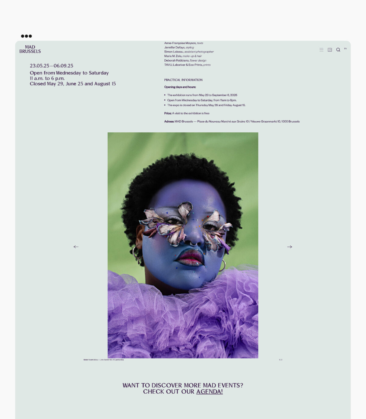
We developed a fresh colour scheme, proposed an iconic system font and created a renewed, more intuitive website navigation.
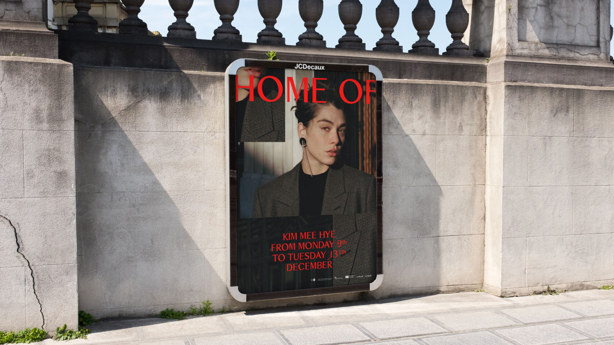
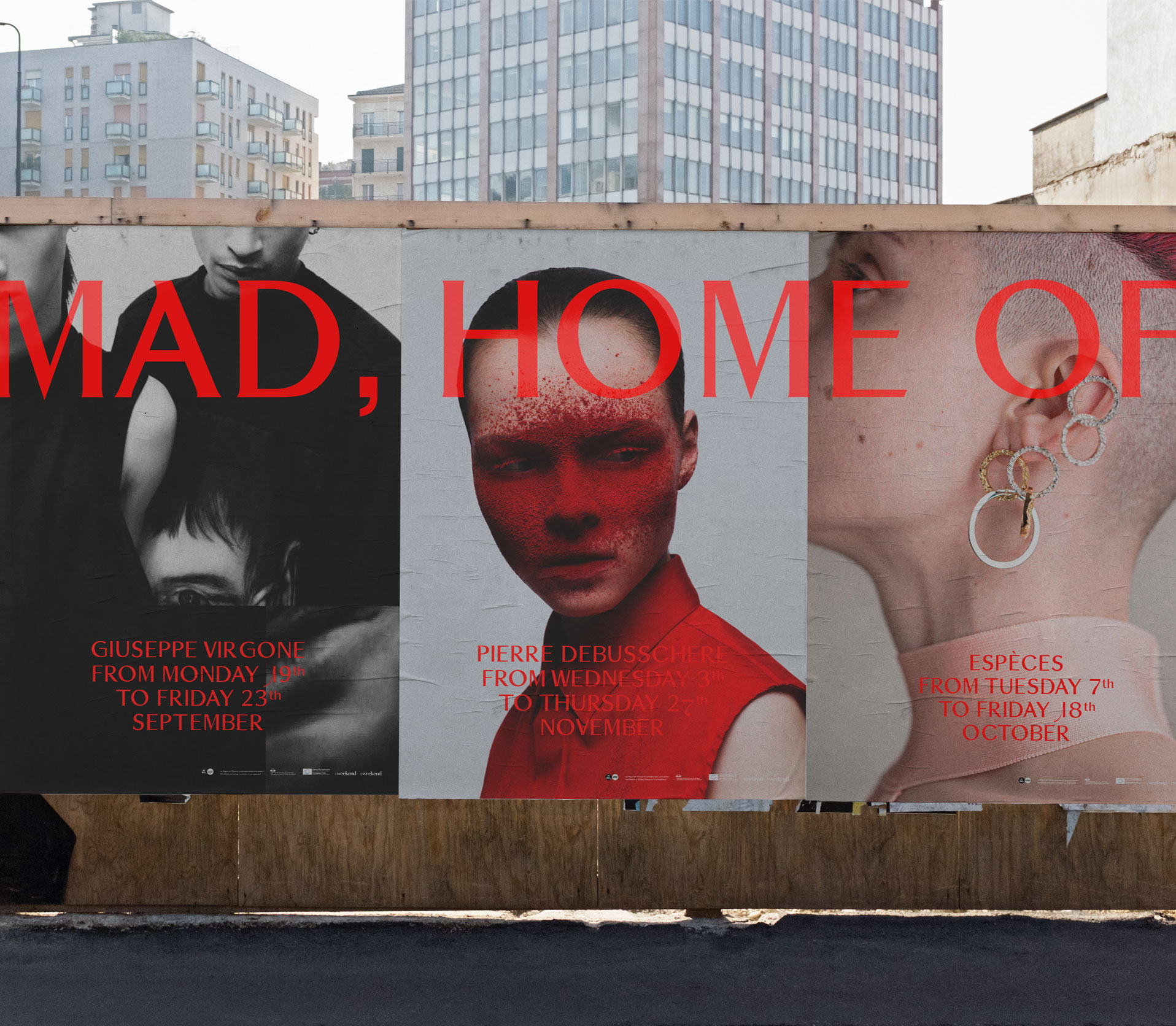
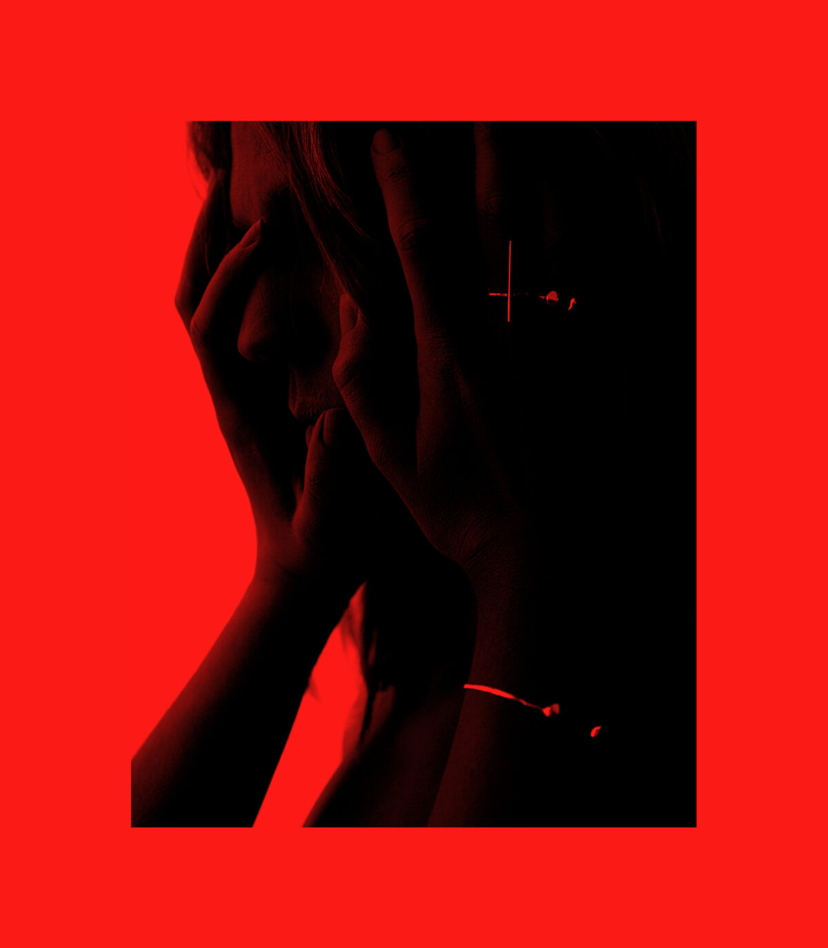
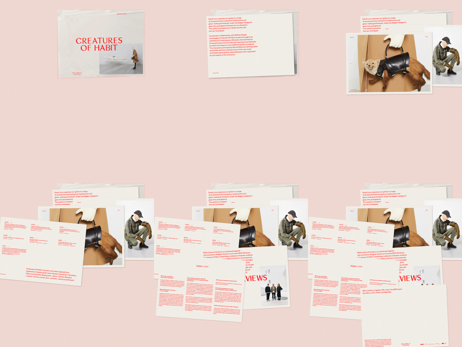
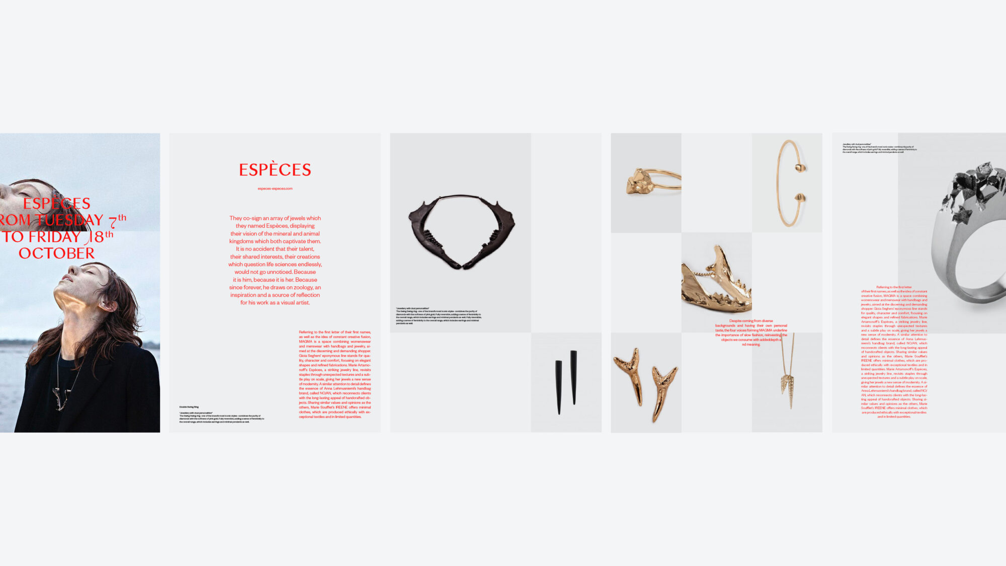
The visual system hinges upon a bold combination of block colours, editorial images showcasing fashion and design work, and strong text overlays. Attention was placed on digital platforms and communication as opposed to print, keeping in line with the institution’s values and ecological outlook.MAD certainly has a voice, and we wanted to facilitate its expression by means of a new identity conceived not only to suit the platform’s current multifaceted activities, but to also accommodate its future evolution.
Created in 2010 by the city of Brussels, MAD is a unique platform that supports the creative development of local designers and stylists.
MAD is an incubator at the forefront of innovation, celebrating fashion and design and promoting local creative talents. Their mission is twofold: while acting as a hub for designers and stylists, MAD is also a space for public activities, confronting a wider audience with on point work by contemporary creators via their exhibition and events programming.
In April 2017 MAD opened the doors of its new multi-purpose building in the heart of Brussels’ buzzing Dansaert area. Our collaboration with the institution has been ongoing for the past thirteen years, as we’ve taken ownership of the entirety of their design and print work. It therefore was a logical step for us to rework MAD’s identity system following their move.
We worked closely with MAD’s core team to grasp their intentions and values, then set out to create a visual strategy that embraced them.
One of their key ambitions was to “turn the building into a home for all Brussels-based fashion and design professionals”. We unfolded this idea, commissioning copy from Club Paradis that personifies MAD as a welcoming character. Simple, direct phrases like “Create, we’ll do the rest” and “This place is your place” help to actively engage the audience, be they designers or general visitors. Emphasis was made on the people who make MAD the key creative hub of the city, giving a sense of ownership to the designers which in turn creates an intriguing, in-depth story for visitors. The phrases are also placed at strategic interior and exterior points in the building, opening up a conversation and reinforcing a feeling of familiarity.
This tone of voice goes hand-in-hand with the visual identity designed and implemented across all communication tools, both print (flyers, signage) and digital (website, instagram, newsletters).
We developed a fresh colour scheme, proposed an iconic system font and created a renewed, more intuitive website navigation.
The visual system hinges upon a bold combination of block colours, editorial images showcasing fashion and design work, and strong text overlays. Attention was placed on digital platforms and communication as opposed to print, keeping in line with the institution’s values and ecological outlook.
MAD certainly has a voice, and we wanted to facilitate its expression by means of a new identity conceived not only to suit the platform’s current multifaceted activities, but to also accommodate its future evolution.
